
Picture this. You walk into a room where the walls, the trim, the ceiling, and even the doors are all painted the exact same color. No white ceiling cutting across the top. No bright white baseboards drawing a hard line around the floor. Just one smooth, rich color wrapping the whole space from corner to corner. That is color drenching, and it is the simplest trick I know for making a normal room look like a designer planned every inch of it. Instead of one lonely accent wall floating in a sea of white, the entire room becomes a single wash of color. It sounds bold when you first hear about it, but when you stand inside a drenched room, it does not feel loud at all. It feels calm, pulled together, and quietly expensive.
The reason it works is simple. When everything in the room is one color, your eye stops jumping from one edge to another. There are no sharp lines where white trim cuts across a colored wall. The corners of the room soften and melt into each other. Small rooms suddenly feel bigger because the walls blur together instead of boxing you in. Large rooms feel cozier because the color wraps around you like a warm blanket. Light behaves differently too. Sunlight bounces off one continuous color and fills the room with a soft, even glow instead of bouncing hard off a white ceiling. At night, lamplight sinks into the color and makes the whole room glow from within, like the walls themselves are lit.
Below you will find sixteen rooms, each drenched in a single rich color from floor to ceiling. I will walk you through what each room looks like, how daylight and lamplight play with the paint, and what kind of furniture lets the color shine its brightest. Some of these rooms are deep and moody. Some are warm and soft. A few are light and airy. Read through them slowly, notice which color makes your heart beat a little faster, and do not be afraid to go all in. A gallon of paint is the cheapest designer trick there is, and every idea below costs little more than that.
1. Deep Forest Green Living Room
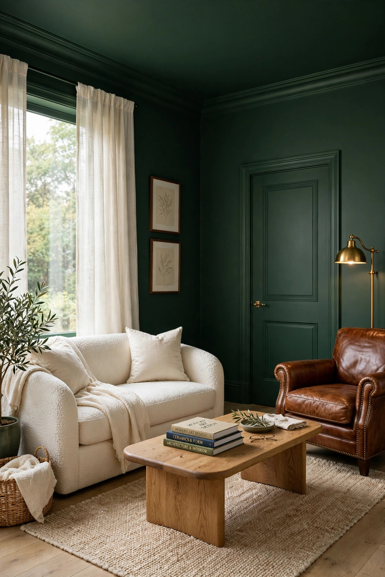
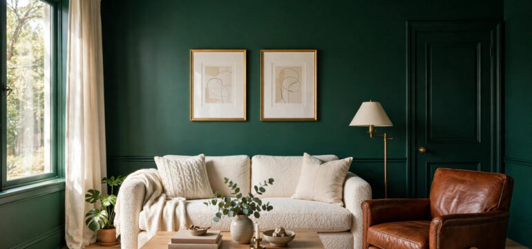
Picture this. You push open the door and step into a living room washed from floor to ceiling in deep forest green. The walls wear it. The baseboards wear it. The crown molding, the window trim, and even the inside of the closet door all wear the same rich green. There is no white anywhere to break the spell, so the whole room feels like one continuous cocoon of color. Against all that green sits a sofa in warm cream boucle, its nubby texture catching the light beside the smooth painted walls. A cognac leather armchair pulls up next to it, the orange brown leather glowing like embers against the dark green. On the oak coffee table, a stack of art books and a small brass bowl catch the afternoon sun. Now watch what happens when daylight pours through the windows. The green does not go flat or muddy. It deepens near the corners and brightens to a soft moss tone where the light lands, so the room feels alive and shifting even when everything in it is perfectly still. At night, two brass floor lamps click on and the walls turn the color of a pine forest after dark, rich and enveloping. A cream wool rug with a quiet pattern anchors the seating area and keeps the dark floor from feeling heavy. On the walls, art in thin gold frames with wide white mats pops forward like pictures in a gallery, because the dark green pushes everything light straight toward your eye.
Now for the practical side, because a color this deep needs the right plan. Start with your green. You want a forest green with a soft gray undertone, not a bright kelly green and not a teal that leans blue. Paint a large swatch on the wall and live with it for two full days, because green shifts a lot between cool morning light and warm evening lamplight. For finishes, use eggshell on the walls and satin on the trim and doors, all mixed in the exact same color. The slight change in sheen gives you quiet depth without breaking the drench. Keep your big furniture pieces light and warm. Cream, oatmeal, cognac leather, and natural oak all sing against deep green. A green velvet sofa might sound fun, but it will melt right into the walls, so save the green for the paint and let the furniture stand in contrast. Plants are your best friend in this room. Their leaves echo the wall color and the whole space starts to feel like a garden room. One thing to watch is the direction your windows face. In a north facing room with cool gray light, a very dark green can feel chilly, so go one shade lighter than your first instinct. And do not skip the ceiling. Painting it green is the move that makes the room feel wrapped and finished instead of simply painted.
2. Warm Terracotta Bedroom
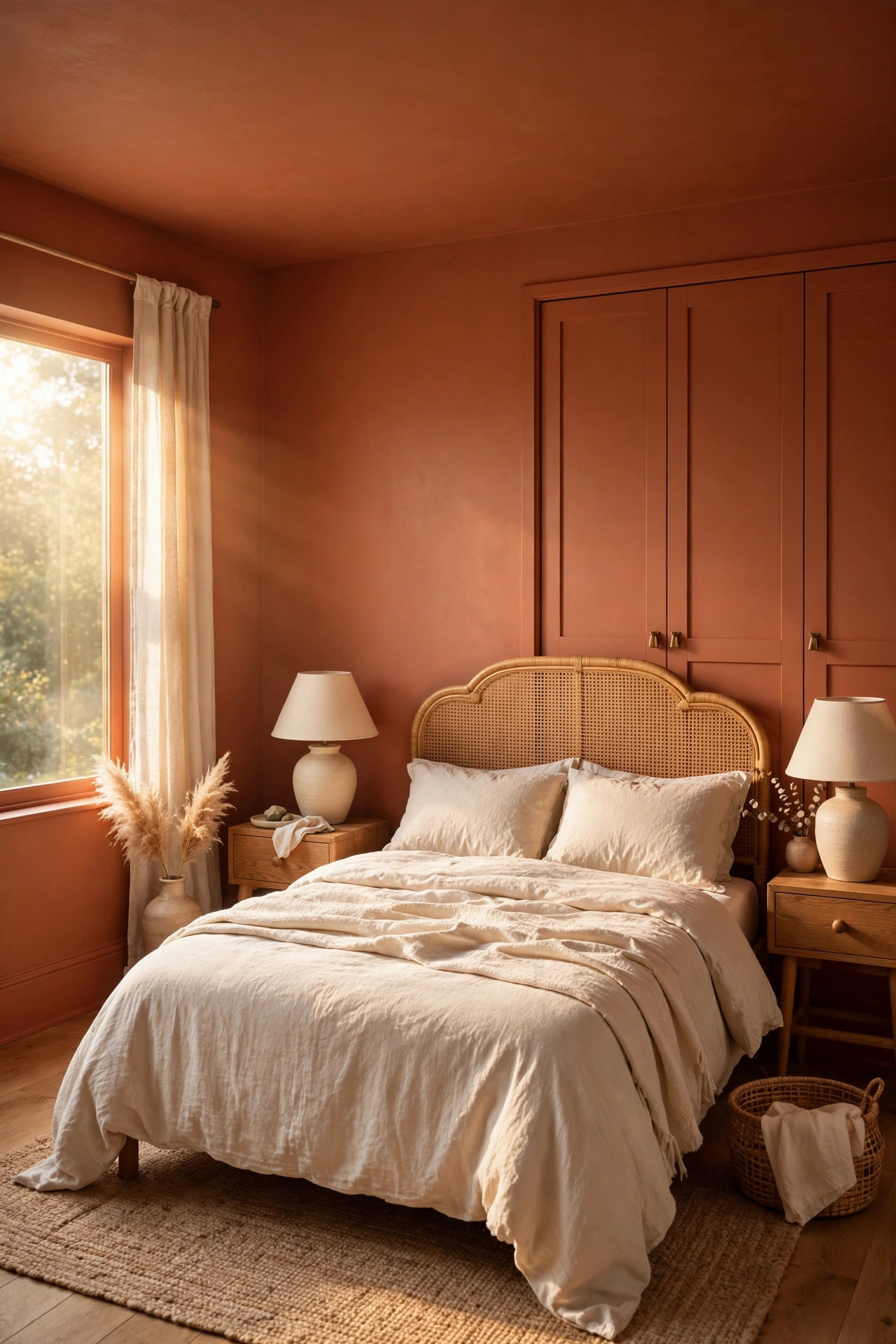
Picture this. You wake up in a bedroom where every surface glows with the warmth of baked clay. The walls, the baseboards, the ceiling, and the closet doors are all washed in terracotta, a sunbaked orange brown that feels like late afternoon light even at eight in the morning. Your bed sits against the main wall dressed in rumpled cream linen, and the pale bedding looks almost luminous against the warm walls. A rattan headboard adds a woven texture that plays beautifully with the smooth paint. On either side, simple oak nightstands hold small ceramic lamps with cream shades, and when those lamps are on, the whole room turns the color of honey. A flat weave jute rug covers the floor and adds an earthy layer underfoot. Sunlight is the real magic here. When morning sun hits a terracotta wall, the color seems to light up from inside, throwing a golden warmth across the bedding and the floor. The room feels like a villa on a hillside, calm and a little bit romantic. In the evening, the same walls go deeper and duskier, more like embers than sunshine, which makes the bedroom feel like the perfect place to curl up with a book. Black metal picture frames with simple line drawings stand out crisply against the warmth, and a tall green plant in the corner looks extra alive with all that orange behind it.
The trick with terracotta is picking the right one, because this color can swing too orange if you are not careful. Look for a terracotta with a brown undertone rather than a bright pumpkin tone. Hold the swatch next to a piece of cream fabric. If the color looks earthy and calm beside the cream, you have a winner. If it looks loud, keep looking. Use a matte or eggshell finish on the walls so the color stays soft, and satin on the trim in the same color for a little wipeable strength. Keep your bedding simple. Cream, oatmeal, and soft white let the walls do all the talking. A throw in a deeper rust or a dusty olive adds interest without fighting the paint. Wood tones are perfect partners here. Oak, walnut, and rattan all feel natural beside terracotta. One honest note is that warm colors pull walls visually closer, which is exactly why terracotta is so wonderful in a bedroom. It makes the room feel like a hug. If your bedroom is tiny and you worry about it feeling tight, keep the ceiling in the same color anyway, because a white ceiling in a terracotta room would chop the space in half and ruin the cocoon.
3. Midnight Navy Hallway
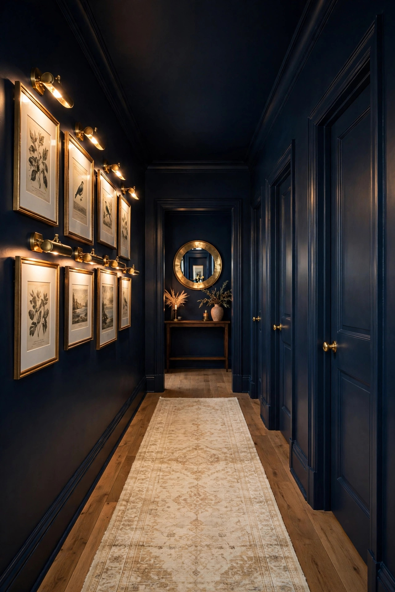
Picture this. You step into a hallway that feels less like a pass through space and more like the corridor of a private art gallery. Every inch is midnight navy, a blue so deep it is almost black. The walls, the baseboards, the ceiling, and all three doors opening off the hall wear the same inky color. There is no white trim to slice the space into pieces, so the long narrow hall reads as one dramatic tunnel of color. Down the center runs a vintage style runner in cream and faded rust, its pattern glowing against the dark floor like a path of light. On one wall hangs a gallery of framed prints, each in a thin brass frame with a wide white mat, and small brass picture lights wash warm pools of light down over the glass. The contrast is stunning. The white mats look almost electric against the navy, and every piece of art gets its moment. At the far end, a round mirror in a brass frame catches light from the living room and throws it back down the hall. By day, whatever daylight spills in from the rooms off the hall turns the navy a rich denim blue near the doorways and lets it fall to near black in the middle, which gives the space a sense of depth and mystery. At night, with the picture lights on, the hallway feels intimate and grand at the same time, like the entrance to somewhere important.
Hallways are the perfect low risk place to try color drenching, because you do not live in them the way you live in a bedroom. Here is how to get this one right. Since hallways get very little natural light, do not fight the darkness. Lean into it. A deep navy looks intentional in a dim hall, while a pale color would just look dingy. Use a satin finish on the doors and trim in the same navy, because the soft sheen will catch the light from your picture lights and sconces and keep the dark color from going flat. Speaking of light, you need it. A hallway drenched in navy with one sad ceiling bulb will feel like a cave, so add picture lights, wall sconces, or both on a warm setting. Keep the runner light. A cream, beige, or faded Persian style runner breaks up the dark floor and leads the eye forward. Hang art with generous white mats, because white is what makes navy look crisp instead of heavy. And paint the ceiling navy too. In a hallway with a tall ceiling, the dark color pulls the height down and makes the space feel proportioned and cozy rather than like a bowling alley.
4. Rich Plum Home Office
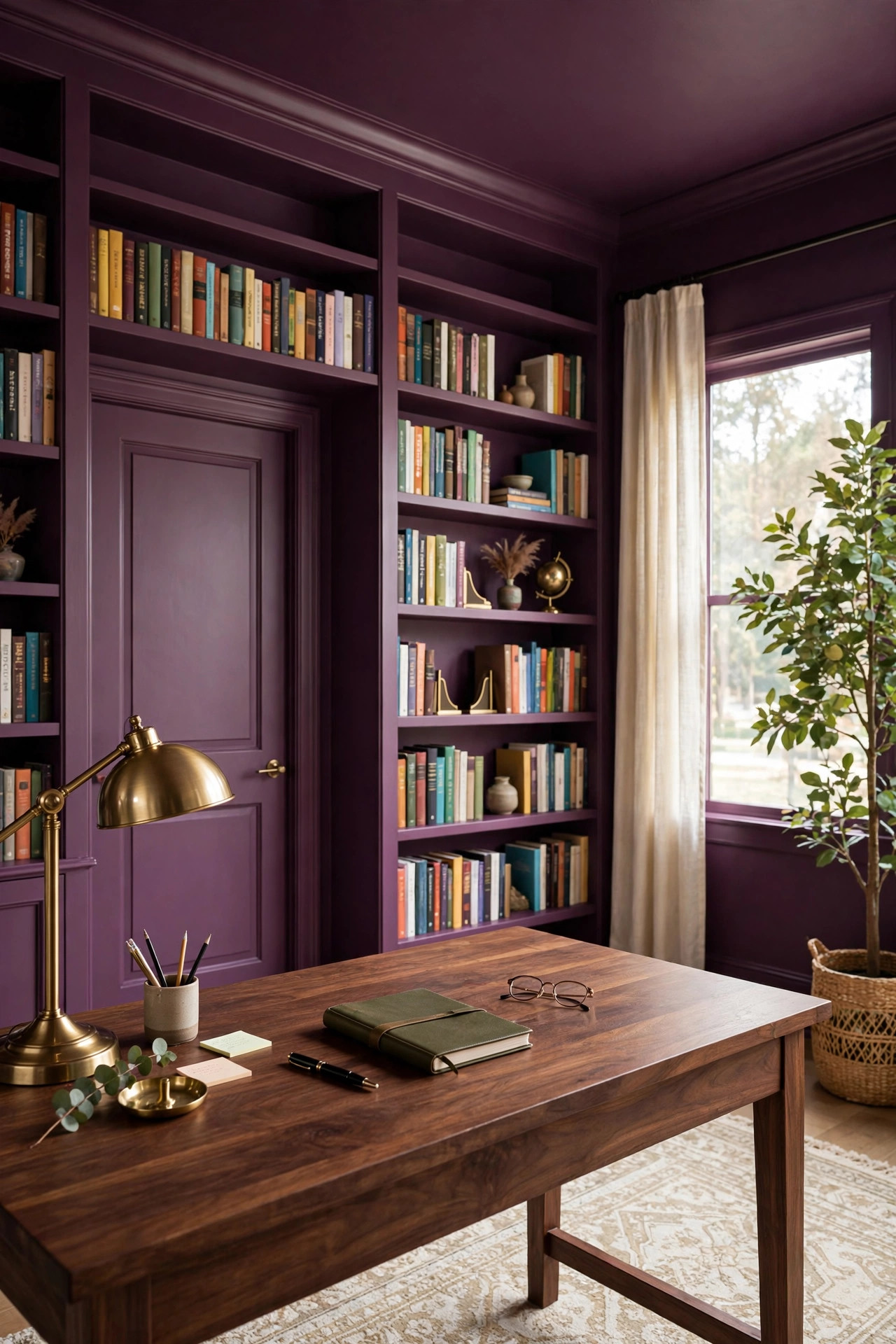
Picture this. You sit down to work in a home office wrapped in rich plum, a deep purple with a wine red heart. The walls, the trim, the ceiling, and the door are all drenched in it, and even the built in bookshelf along one wall is painted the exact same plum, so the shelves melt into the architecture and the books appear to float. Your desk is warm walnut wood, and against the plum it looks like it is glowing from within. A brass desk lamp throws a warm pool of light across your papers, and the brass gleams against the dark purple like jewelry. Behind you, the bookshelf holds rows of colorful book spines that pop forward dramatically, because plum makes every other color look more vivid. A tall fig plant in the corner adds a slash of green that feels electric against the purple. By day, soft daylight turns the plum a rich berry tone that feels creative and energized, the kind of color that makes you want to start a project. In the evening, with just the desk lamp on, the room goes moody and cocoon like, and the walls fall back into shadow while your work stays lit. It is the rare office that feels both inspiring and calming. A cream and rust patterned rug softens the dark wood floor, and a single large piece of abstract art in a black frame gives your video call background a polished, deliberate look.
Plum is a brave choice, so let me talk you through making it work. You want a plum with a red or wine undertone, not one that leans toward bright purple or lavender. Test your swatch at night under your actual desk lamp, because plum changes more than most colors once the sun goes down. Keep the desk and shelving in warm wood tones. Gray office furniture will look cold and dull against plum, while walnut, oak, and even a warm rattan chair feel rich beside it. Paint the bookshelf the same plum as the walls. This is the designer move that makes the whole room feel custom and expensive, and it costs nothing extra beyond the paint you already bought. For lighting, stick with warm white bulbs. Cool daylight bulbs will pull the purple toward blue and the room will lose its warmth. Add one cream or oatmeal element, a rug, curtains, or a throw, to give your eyes a place to rest. And do not be shy about the ceiling. A white ceiling in a plum office would glare down at you all day. Plum above you feels like working inside a jewel box. If you share the office with a partner, repeat the same wood and brass on both desks so the room stays unified. Keep cables tidy with simple clips, because clutter shows more against dark walls. A plum office rewards order.
5. Creamy Warm Beige Kitchen
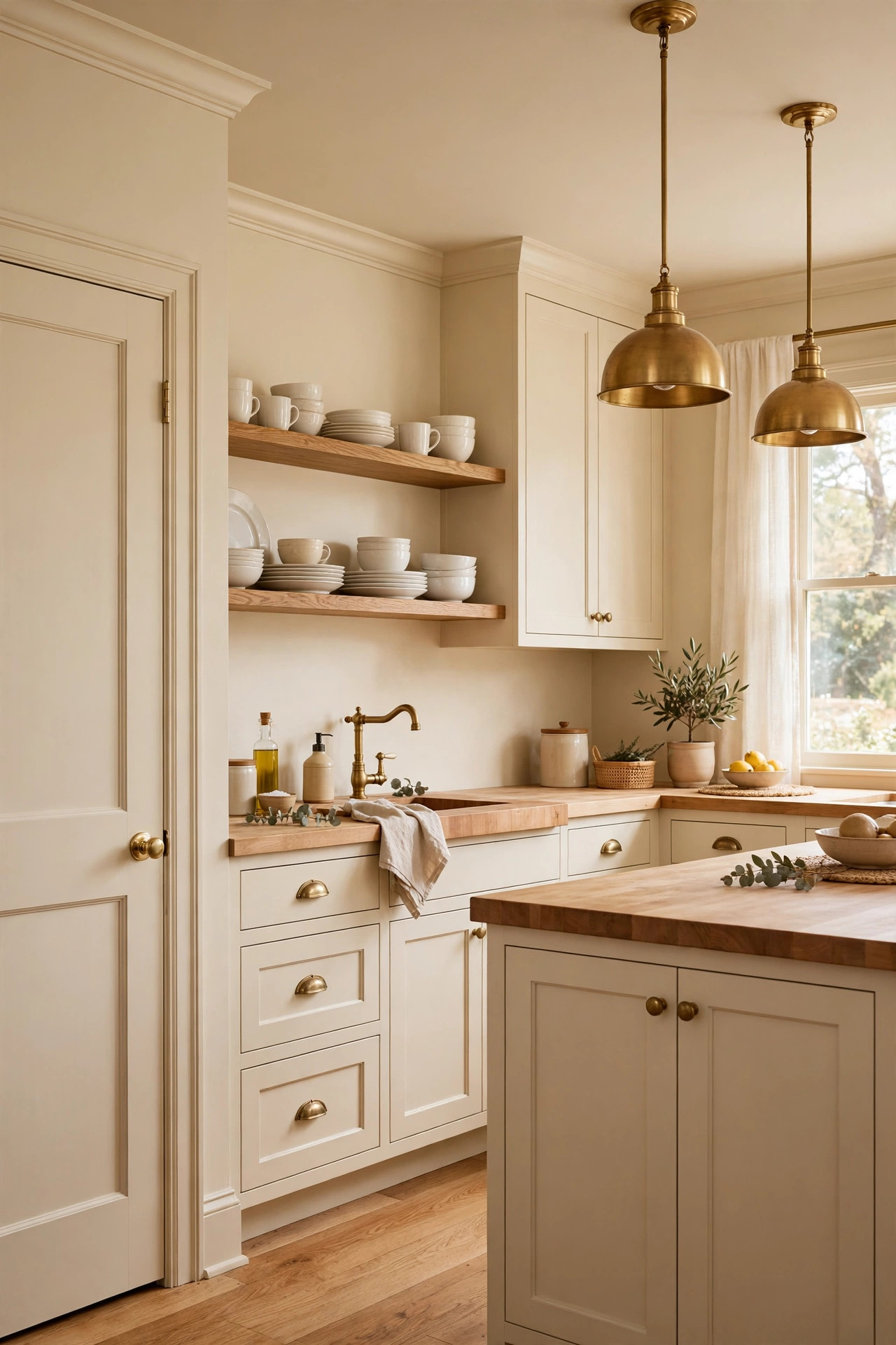
Picture this. You walk into a kitchen that feels like warm milk and morning light. Every surface is creamy warm beige, a soft golden neutral that sits between white and tan. The walls wear it. The trim and the ceiling wear it. The pantry door wears it. And here is the bold part, the cabinets wear it too, all painted in the exact same beige, so the whole kitchen reads as one calm, seamless wash of color. There are no harsh contrasts anywhere, just soft edges melting into each other. The countertops are warm butcher block, and the wood grain glows against the beige like toast beside butter. The hardware is unlacquered brass, already starting to develop a soft patina that looks beautiful against the creamy cabinets. Open oak shelves on one wall hold stacks of white dishes and clear glasses that shine like little sculptures against the beige wall behind them. Daylight pours through the window over the sink and the whole room seems to glow from within, the beige turning golden where the sun lands and softening to a gentle oatmeal in the corners. At night, under cabinet lights and a pair of brass pendants over the island, the kitchen feels like candlelight, warm and inviting. A runner in a faded vintage pattern adds a whisper of color underfoot without breaking the calm. It is the kind of kitchen that makes you want to linger over coffee.
A beige drenched kitchen lives or dies on undertone, so choose carefully. You want a warm beige with a soft golden or creamy undertone. Hold the swatch next to a white piece of paper. If the beige looks pink or green beside the white, put it back and keep looking. Kitchens need washable paint, so use a satin or washable eggshell on the walls and a durable satin on the cabinets, all in the same color. The sheen difference between walls and cabinets gives you subtle variety while the color stays unified. Butcher block counters are the dream partner for beige, but a light warm stone works beautifully too. Stay away from cool gray stone, which will fight the warmth. Brass hardware is the classic match, and black hardware works if you want a little more contrast. Keep the backsplash simple. Either run the beige paint behind open shelves or choose a handmade look tile in a matching cream. One honest tip is that a light drench like this is the most forgiving kind of color drenching. It makes small kitchens feel larger because there are no visual breaks, and it makes dated cabinets look intentional and custom with nothing more than paint.
6. Dark Charcoal Bathroom
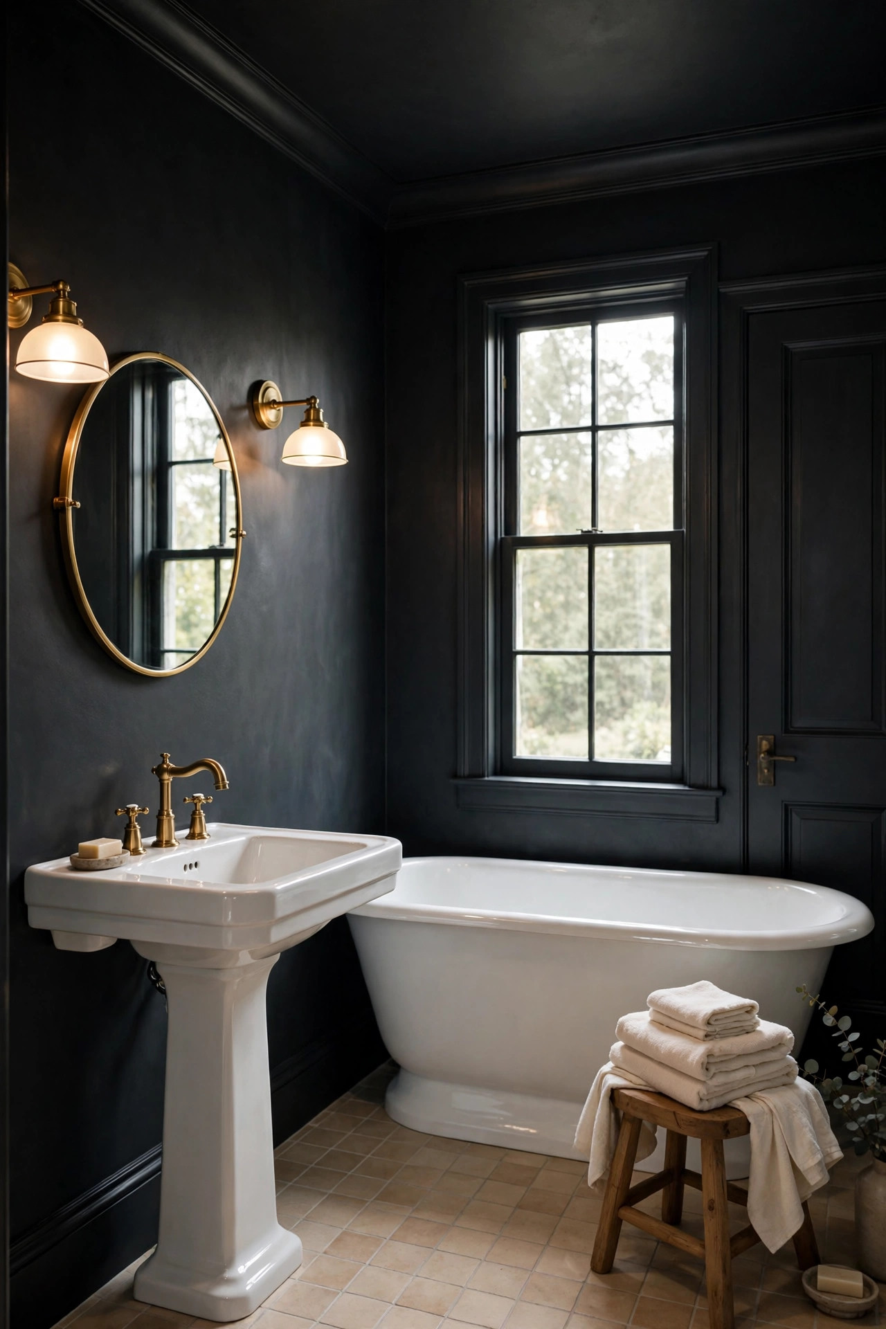
Picture this. You push open the bathroom door and step into a space that feels like a high end spa after hours. The walls, the trim, the ceiling, and the door are all dark charcoal, a deep gray with a whisper of warmth that keeps it from feeling cold. Against all that darkness, the white pedestal sink and the white tub glow like sculptures in a museum. They are the brightest things in the room, and the charcoal makes them look intentional and beautiful instead of just plain. A round brass mirror hangs over the sink, and two brass sconces on either side throw warm light across your face and bounce it softly off the dark walls. The floor is a light warm tile that keeps the room grounded and stops the darkness from feeling heavy underfoot. A folded stack of cream towels on a wooden stool adds a soft pale note, and a small green plant on the windowsill looks almost neon against the charcoal behind it. By day, whatever daylight comes through the frosted window turns the charcoal a soft smoky gray near the glass and lets it deepen to near black in the corners, which gives the small room a surprising sense of depth. At night, with the sconces on, the walls seem to fall away entirely and the room feels intimate and cocooned, like the rest of the world has gone quiet.
Small bathrooms and powder rooms are the number one place designers try dark drenching, because the small size makes it low risk and the drama makes it unforgettable. Use a paint made for bathrooms, usually labeled bath paint, in a satin finish on every surface. It resists moisture and wipes clean, which matters in a room full of steam. Keep your big fixtures white. This is the whole trick. The white tub, toilet, and sink become the stars against the dark walls, and you do not need to buy a single new fixture to get the effect. Choose one warm metal and stick with it. Brass, bronze, or warm gold all glow beautifully against charcoal. A large mirror is almost required, because it bounces light around and doubles the sense of space. If you have a window, dress it simply with a cream roman shade that adds one more pale note. And yes, paint the ceiling charcoal. In a tiny bathroom, a white ceiling would feel like a lid. A dark ceiling makes the walls melt upward and the room feels taller and more finished. Finish with a small wooden bath caddy across the tub for a book and a candle. Keep countertop clutter to a minimum, because dark walls make every stray bottle more visible. Two matching towel hooks in your chosen metal keep the look tidy.
7. Olive Green Dining Room
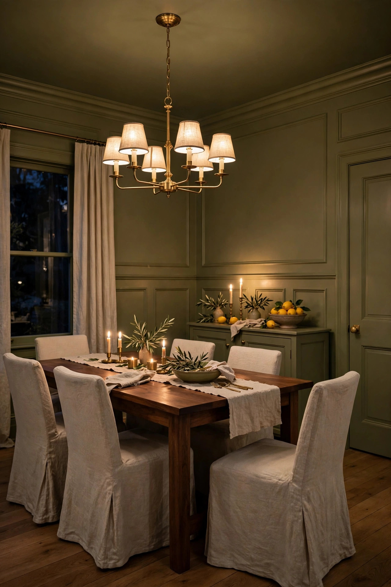
Picture this. You gather around the table in a dining room wrapped in olive green, an earthy, savory color that sits between green and gold. The walls, the wainscoting, the trim, the ceiling, and the doors all wear it, so the room feels like the inside of a sunlit grove. Your dining table is warm walnut, and its rich brown grain looks even deeper against the olive walls. Around it sit chairs in natural linen slipcovers, their pale oatmeal color glowing softly in the green light. Above the table hangs a brass chandelier with linen shades, and when it is lit, the whole room fills with a golden green glow that makes everyone at the table look their best. Candlelight does something wonderful here too. The flames pick up the gold in the olive paint and the walls seem to shimmer. On the sideboard, a bowl of lemons and a stack of cream plates become a still life against the green. A large piece of landscape art in a dark wood frame anchors one wall, its greens and golds melting right into the room. By day, sunlight turns the olive bright and fresh, almost like spring leaves. By night, under lamplight, it goes deep and enveloping, and the room feels made for long dinners and good conversation that stretches past midnight.
Olive is one of the most flattering dining room colors ever, but the undertone matters. You want an olive with a warm golden heart, not one that leans toward murky brown or acidic yellow green. Test your swatch in the evening, because dining rooms are mostly used after dark and the color you love at noon might feel different under the chandelier. Pair olive with warm woods, walnut, oak, and cherry all look at home here. Cream and oatmeal textiles keep the room fresh, while black accents, like the chandelier chain or picture frames, add a crisp tailored edge. If you have a sideboard or built ins, paint them the same olive as the walls. They will disappear into the architecture and your dishes and serving pieces will take center stage. A rug under the table in a warm faded pattern softens the floor and adds comfort underfoot. Choose a rug big enough that the chairs stay on it when pulled out. And do not fear the ceiling. An olive ceiling over a dining table feels like being under a canopy of leaves, intimate and a little bit magical. For the table itself, cream placemats and white dishes keep things fresh against the green. A low bowl of fruit or a simple green plant makes an easy centerpiece. Avoid tall centerpieces that block conversation across the table.
8. Dusty Blue Nursery
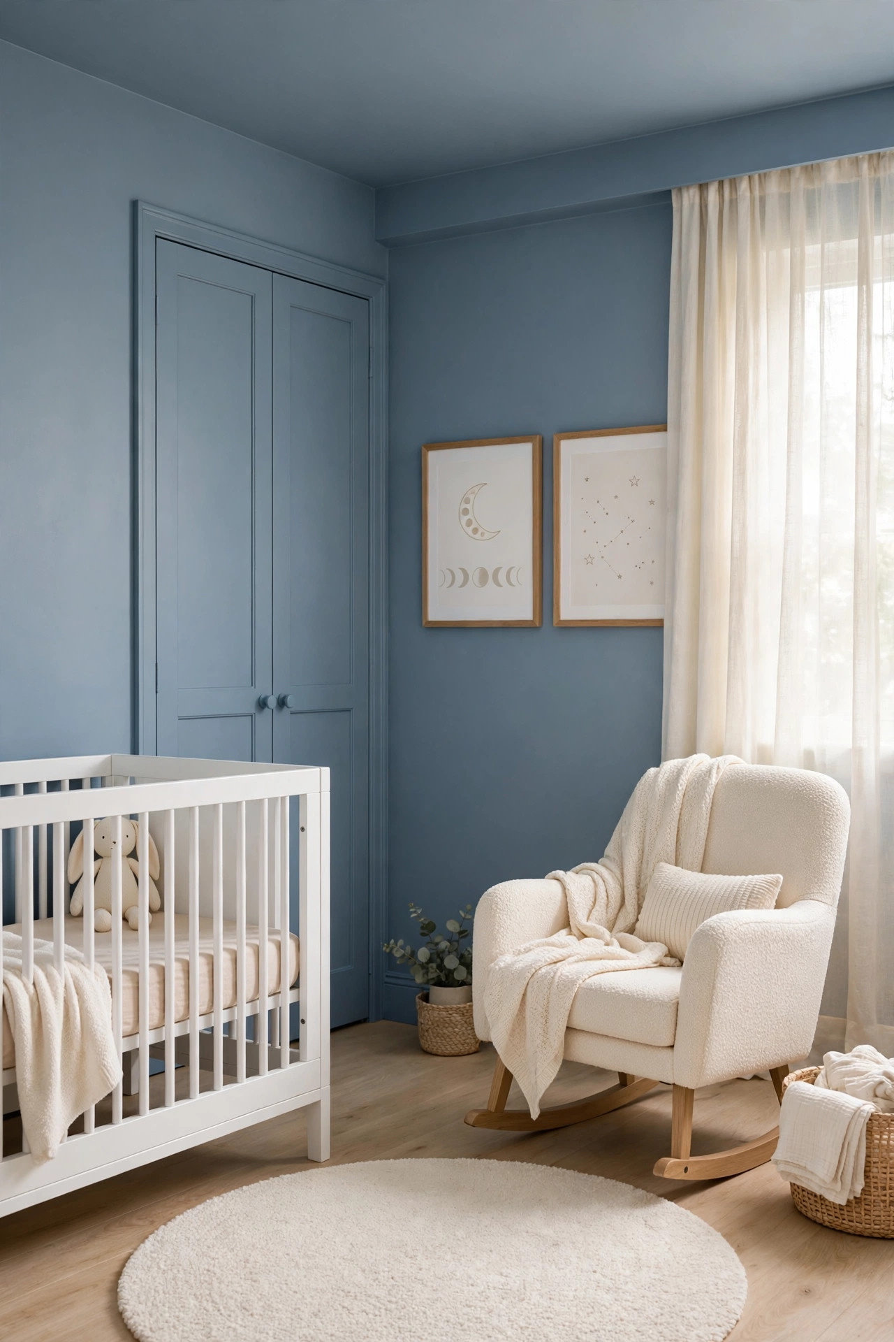
Picture this. You step into a nursery washed in dusty blue, a soft gray blue that feels like a calm morning sky. The walls, the baseboards, the ceiling, and the closet doors all wear it, wrapping the little room in one continuous hush of color. Against the blue, the white crib stands out like a crisp white sail, clean and bright and impossible to miss. Beside it, a boucle rocking chair in warm cream invites you to sit, its nubby texture soft against the smooth painted walls. A round cream rug with a subtle texture covers the floor where little knees will crawl. Sheer cream curtains filter the daylight into something gentle, and the dusty blue walls seem to hold the light softly instead of bouncing it around. On the wall above the dresser, three simple framed prints with white mats, a moon, a star, a sleepy animal, pop forward against the blue like illustrations in a storybook. A small oak bookshelf holds a row of colorful picture books, and their bright spines look extra cheerful against the calm blue behind them. In the evening, with a warm dim lamp glowing in the corner, the room turns a deeper slate blue and feels like the inside of a lullaby. It is peaceful without being boring, and it never feels babyish in a way you will tire of.
Dusty blue is the nursery color that grows up gracefully, which is exactly why it is worth drenching. This is a room you will repaint in a few years anyway, so choose a blue with a soft gray undertone that works for a baby today and a big kid tomorrow. It reads calm and a little bit tailored, never saccharine. Use a washable eggshell or matte finish on the walls, because little hands touch everything, and choose a low odor, low VOC paint for peace of mind. Keep the big furniture white or cream. The white crib against the blue wall is the whole look, crisp and fresh. Natural wood, like an oak dresser or bookshelf, warms the blue beautifully. For curtains, pick a warm cream blackout fabric. It gives you the darkness naps need while adding one more soft pale layer. Add art with generous white mats, because white on dusty blue is the crisp contrast that keeps the room from feeling flat. And paint the ceiling the same blue. A white ceiling in a small nursery would feel like a bright lid. The blue ceiling makes the room feel wrapped and restful, like being tucked in. A soft night light in a warm tone keeps nighttime feeds calm without harsh brightness. Keep the floor clear with closed storage bins in cream, so toys disappear quickly at the end of the day.
9. Rust Orange Entryway
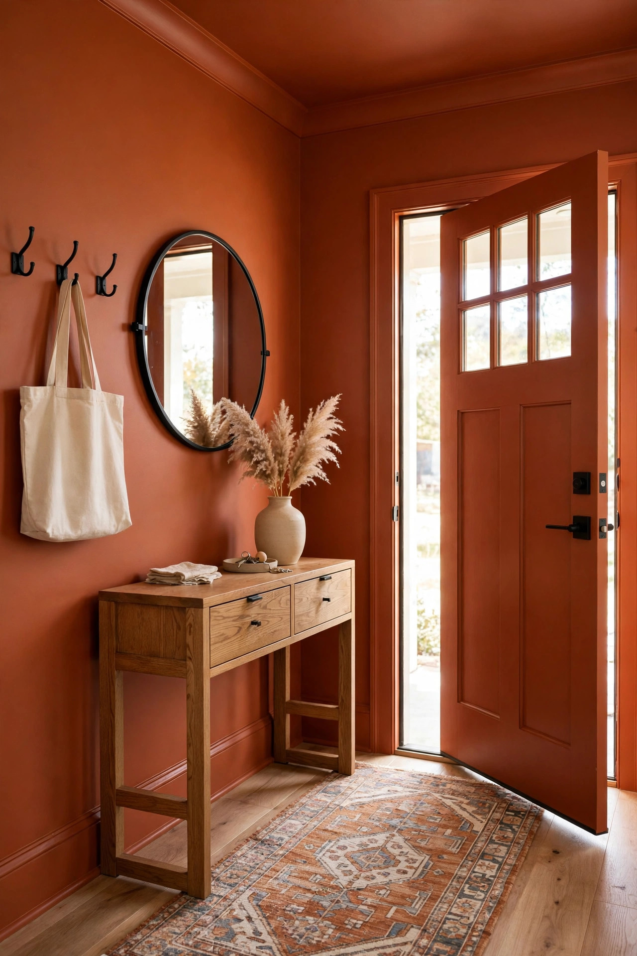
Picture this. You come home and step into an entryway that greets you like a warm embrace. The walls, the trim, the ceiling, and the inside of the front door are all rust orange, a burnt earthy orange with a brown heart that feels like autumn leaves and clay pots. It is a small space, so the color hits you all at once, bold and welcoming. Against the rust wall, a simple oak console table looks rich and grounded, its honey colored wood glowing beside the orange. Above it hangs a round mirror in a thin black frame, and the mirror catches daylight from the door glass and throws it dancing across the rust walls. A row of black metal hooks holds a cream canvas tote and a woven straw hat, and the pale accessories pop crisply against the deep orange behind them. Underfoot, a small vintage style runner in cream and faded blue adds pattern and softness. A ceramic vase on the console holds dried pampas grass, its feathery plumes almost glowing against the rust. By day, sunlight through the door glass turns the walls a bright coppery orange that feels energized and happy. In the evening, with a small table lamp lit on the console, the entry goes deep and ember like, and coming home feels like walking into a hearth. The best part is the scale. Because the space is tiny, the bold color feels like a jewel box, not a commitment, and guests get an instant sense that this is a home with personality.
An entryway is the smartest place to try your boldest color, because it is small, you pass through it quickly, and repainting it later would take a single afternoon. For rust, you want an orange with a strong brown undertone, more clay pot than traffic cone. Hold the swatch next to a piece of natural wood. If it looks earthy and rich, you are on the right track. If it looks neon, walk away. Use a satin finish on the trim and the door in the same rust, because entryways take a beating from hands, bags, and shoes, and satin wipes clean. Keep your console table in natural wood. Painted furniture would disappear into the walls, while oak, walnut, or even a warm rattan piece stands out beautifully. Add one big mirror. It bounces light into a space that is often dark, and it doubles the glow of the color. Black accents, hooks, frames, a small stool, give the orange a crisp tailored edge. A light colored runner or rug keeps the floor from going dark and heavy. And paint the ceiling rust too. In a small entry with a standard height ceiling, the matching color makes the space feel intentional and wrapped, like the first page of a good book.
10. Pine Green Laundry Room
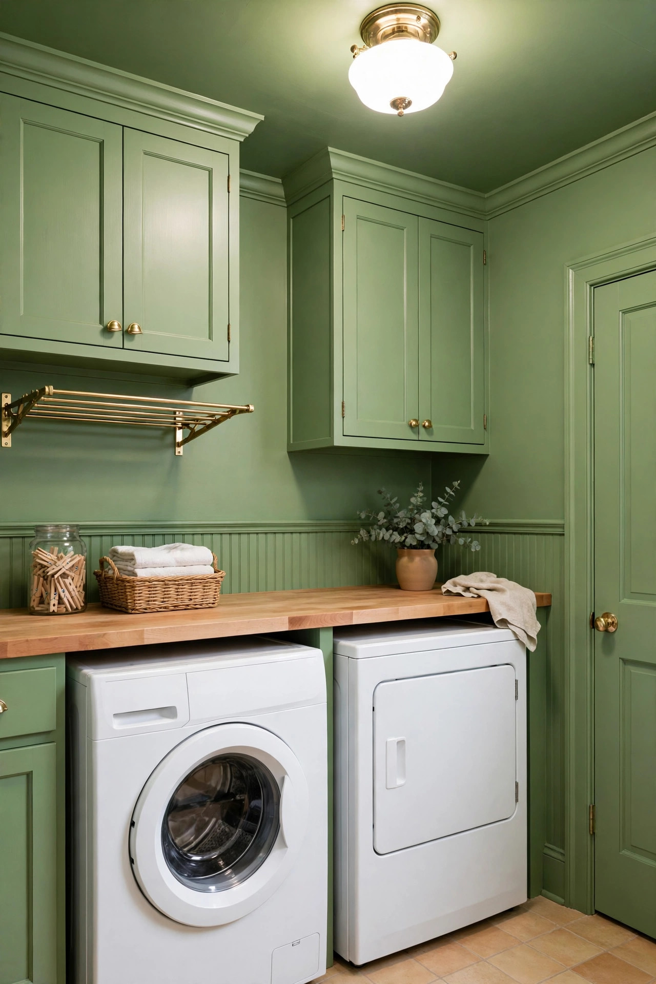
Picture this. You open the door to the laundry room and instead of a sad white box, you find a little jewel of a room wrapped in pine green, a deep clean green with a cool fresh heart. The walls, the trim, the ceiling, and the door all wear it, and even the cabinets above the machines are painted the same pine green, so they melt into the walls and the whole room reads as one smooth wash of color. Against all that green, the white washer and dryer pop forward like fresh laundry on a line, bright and crisp. A warm butcher block counter runs across the top of the machines, and its honey wood glows against the green like sunlight through trees. On the counter sits a small stack of folded cream towels and a glass jar of wooden clothespins, little pale notes that shine against the dark. A brass wall mounted drying rack folds out beside the window, its golden metal gleaming against the pine walls. The floor is a light warm tile that keeps the room from feeling heavy underfoot. By day, whatever light comes through the small window turns the green fresh and lively near the glass and lets it deepen to a rich forest tone in the corners. At night, under a warm ceiling light, the room feels like a cozy cabin, and folding laundry stops feeling like a chore. A framed vintage laundry print with a wide white mat hangs on the one open stretch of wall, its white border popping against the green like a gallery piece.
Laundry rooms are usually the most neglected rooms in the house, which is exactly why drenching one feels so delightful. You spend real time in here, so make it pretty. Since laundry rooms are often small and sometimes windowless, do not fight the lack of light. Lean into the mood the way you would in a hallway. A deep pine green looks intentional and rich in a dim room, while a pale color would just look flat. Use a satin or washable eggshell finish on every surface, because laundry rooms deal with humidity, lint, and the occasional splash. Paint the cabinets the same green as the walls. This single move makes a basic builder laundry room look custom and expensive. Keep the machines white if you can, because white appliances against dark green is the crisp contrast that makes the whole room sing. Add warm wood somewhere, a counter, a shelf, a stool, to keep the green from feeling cold. Good lighting is not optional here. You need to see stains and read labels, so add the brightest warm white bulbs the fixture allows. And yes, paint the ceiling green. In a small workroom, the matching ceiling makes the space feel finished and deliberate instead of forgotten.
11. Soft Black Reading Nook
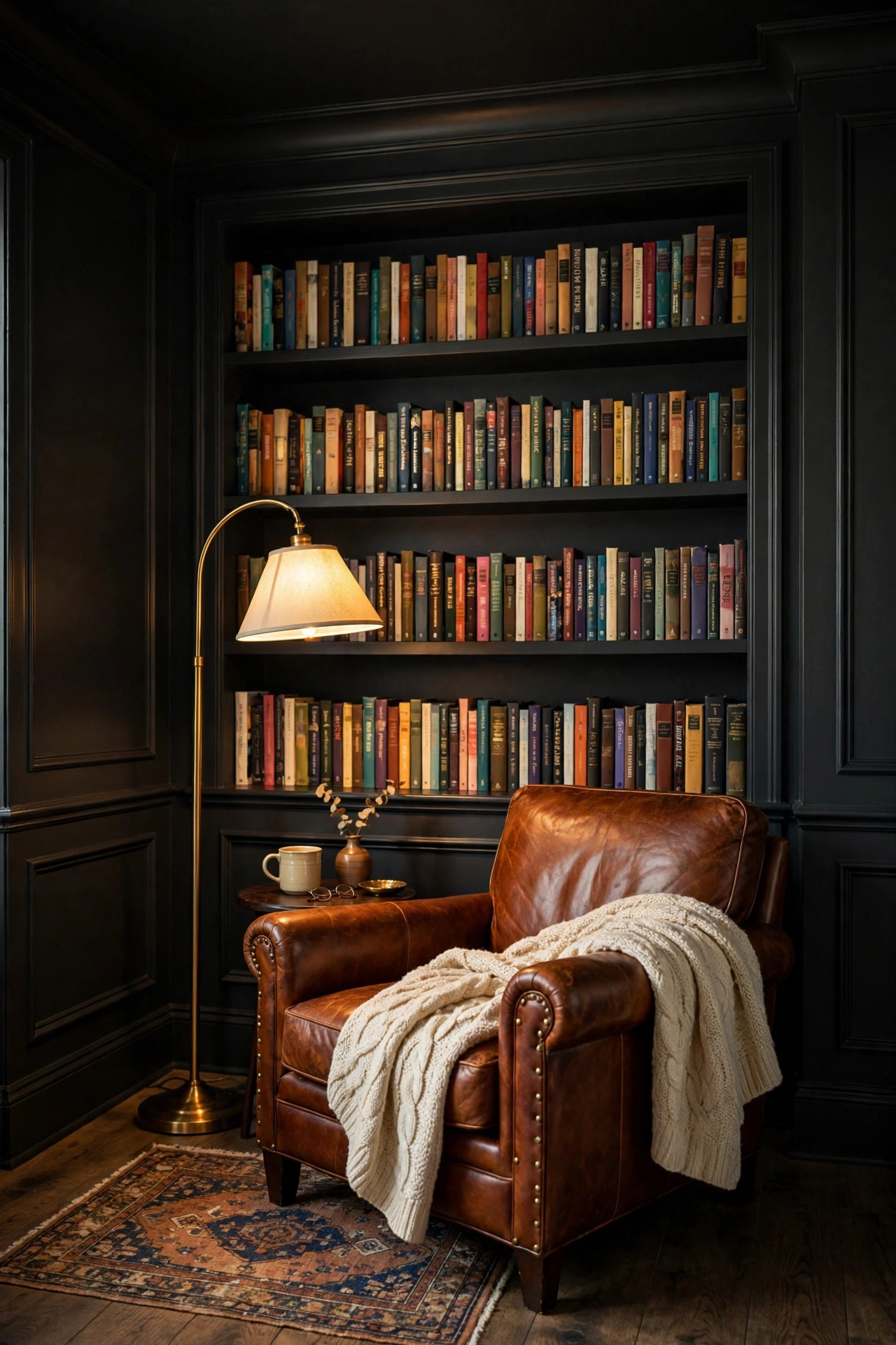
Picture this. You tuck into a reading nook wrapped in soft black, a deep warm black that feels like the inside of a velvet jewelry box. The walls of the nook, the trim, the little stretch of ceiling above it, and the built in bookshelf are all painted the same soft black, so the whole corner reads as one continuous cocoon. The bookshelf is the star. Because it wears the same black as the walls, the shelves disappear and the books appear to float, their colorful spines popping forward like jewels on dark velvet. In front of the shelves sits a cognac leather armchair, worn and buttery, and the orange brown leather glows against the black like firelight. A brass arc floor lamp curves over the chair, throwing a warm pool of light exactly where your book rests, and the brass gleams against the darkness. A chunky cream knit throw spills over the arm of the chair, its pale texture a soft contrast to the smooth dark paint. Underfoot, a small vintage rug in faded rust and cream adds pattern and warmth. By day, daylight from the nearby window turns the black a soft smoky charcoal near the light and lets it fall to true darkness in the corners, which makes the nook feel deep and sheltering. At night, with only the reading lamp on, the rest of the room falls away entirely and it is just you, the chair, and the book. It is the coziest square footage in the entire house.
A reading nook is the perfect first drench, because it is a small area, it takes very little paint, and the whole point of the space is coziness, which dark colors do best. Choose a soft black with a warm undertone, not a blue black and not a pure harsh black. Hold the swatch next to a piece of cream fabric. If it looks like dark chocolate or espresso, you have the right one. If it looks like a chalkboard, keep looking. Paint the bookshelf the exact same black as the walls. This is the move that makes built ins look custom and makes your books look like a curated display. Your chair should be warm and light. Cognac leather, caramel velvet, or even a cream boucle chair all glow beautifully against black. Gray or black furniture would vanish, so save those for another room. Lighting is everything in a dark nook. You need a strong warm reading light, because dark walls absorb light instead of bouncing it. A brass or gold lamp adds a jewel like gleam that black walls show off perfectly. Add one cream or oatmeal textile, a throw or a small pillow, to give your eyes a pale resting place. And frame one piece of art with a wide white mat. White on black is the crispest contrast there is, and it will look like a gallery piece.
12. Warm White Family Room
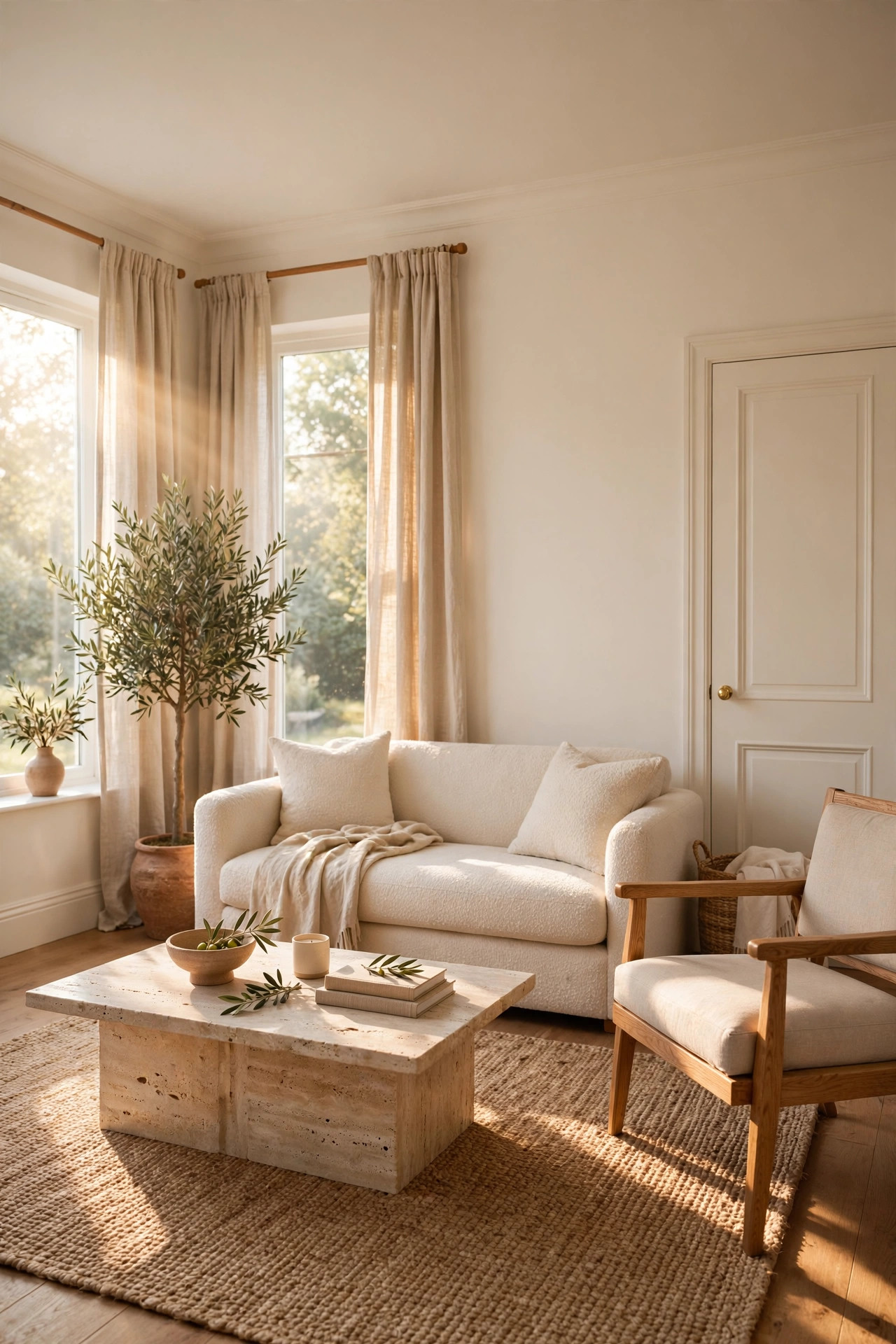
Picture this. You walk into a family room drenched in warm white, a soft creamy white that feels like fresh linen and morning milk. The walls, the trim, the ceiling, and the doors all wear the same warm white, and at first glance the room might look simply white. But look closer and the magic appears. Because every surface shares one color, texture becomes the star. A cream boucle sofa with its nubby loops catches the daylight and throws tiny shadows across itself. Linen curtains in natural flax filter the sun into something golden. A chunky wool throw in oatmeal spills over the arm of an oak framed chair. A jute rug adds a woven earthy layer underfoot, and a travertine coffee table brings in the cool smoothness of stone. With no color contrasts to distract you, your eye starts noticing all these textures, and the room feels rich and layered even though the palette is almost entirely white. Daylight is the best decorator here. Morning sun turns the warm white golden and glowing, while the soft light of late afternoon makes it look like candlelight. At night, with warm lamps on, the room feels like the inside of a pearl, luminous and calm. Art in natural oak frames with white mats hangs on the walls, quiet and gallery like. A tall olive tree in a clay pot adds the one note of green, and against all that white it looks like a sculpture.
A white drench is the gentlest way into color drenching, and it is perfect if deep colors scare you. The secret is choosing a warm white, not a stark blue white and not a dingy yellow white. Hold swatches next to a piece of cream linen in your actual room light. You want the white that looks soft and glowing, like candlelight on paper. Here is the designer trick that makes a white drench work. Vary the sheen while keeping the color identical. Use flat paint on the ceiling, eggshell on the walls, and satin on the trim and doors, all in the same warm white. The color never breaks, but the light plays differently on each surface and you get quiet depth without any contrast. Since the color does so little talking, texture must do it all. Layer boucle, linen, wool, jute, oak, and stone. The more textures, the richer the room feels. Keep your wood tones warm. Oak, walnut, and rattan all glow against warm white, while cool gray woods would look chilly. Add one living thing, a tree, a big plant, a bowl of green apples. Against all that white, green becomes the artwork. And do not skip painting the ceiling. A bright white ceiling in a warm white room would actually look colder than the walls. The matching warm white above you makes the whole room feel wrapped in light.
13. Sage Green Bathroom
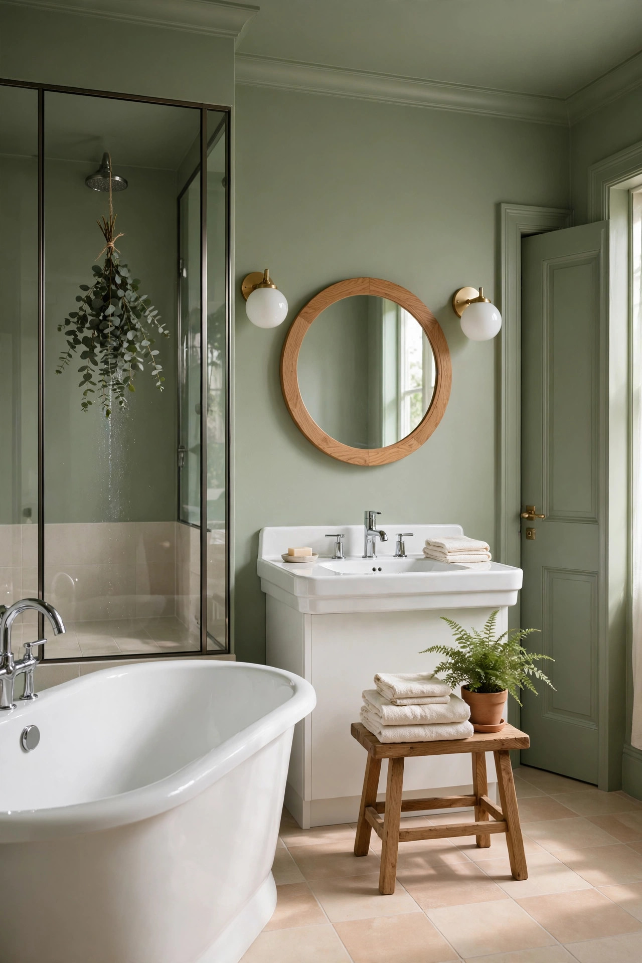
Picture this. You step into a bathroom washed in sage green, a soft gray green that feels like eucalyptus leaves and sea mist. The walls, the trim, the ceiling, and the door all wear it, and the whole small room feels like a deep breath. Against the sage, the white tub and the white sink glow softly, not with the sharp pop they would have against charcoal, but with a gentle luminosity, like white stones in a green stream. A round oak framed mirror hangs over the sink, and the warm wood looks beautiful against the cool green. On either side, simple white globe sconces throw a soft even light that makes the sage look silky. A wooden stool beside the tub holds a folded stack of cream towels and a small potted fern, and the green of the fern melts right into the green of the walls. The floor is a pale warm tile that keeps the room feeling light and clean underfoot. A sprig of eucalyptus hangs from the showerhead, and its dusty green leaves echo the walls while its scent fills the steam. By day, daylight through the frosted window turns the sage bright and fresh near the glass, like morning in a garden. In the corners it deepens to a soft moss tone that feels sheltering. At night, with the sconces glowing, the room feels like a quiet spa, and a long soak in the tub becomes the best part of the day.
Sage is the bathroom color for people who want calm without drama, and drenching it makes the calm go all the way. Choose a sage with a soft gray undertone rather than one that leans yellow or minty. The gray is what keeps it sophisticated instead of sweet. Test your swatch in the actual bathroom light, because sage shifts a lot between daylight and warm bulbs. Use a bath rated paint in a satin finish on every surface. Bathrooms are steamy, and you need paint that resists moisture and wipes clean. Keep your fixtures white. White against sage is a soft classic pairing that never looks harsh. Warm wood is sage’s best friend. An oak mirror frame, a teak stool, or a wooden bath caddy all add warmth that keeps the green from feeling cool. For metals, both chrome and brass work. Chrome feels fresh and modern against sage, while brass feels warm and traditional. Pick one and use it everywhere. A big mirror is worth its weight here, because it bounces the limited light around and makes the small room feel twice as big. Add one living plant that loves humidity, a fern or a pothos, and watch it thrive. And paint the ceiling sage. In a bathroom, a white ceiling would glare. The matching green above you makes the room feel wrapped and restful.
14. Burgundy Dining Nook
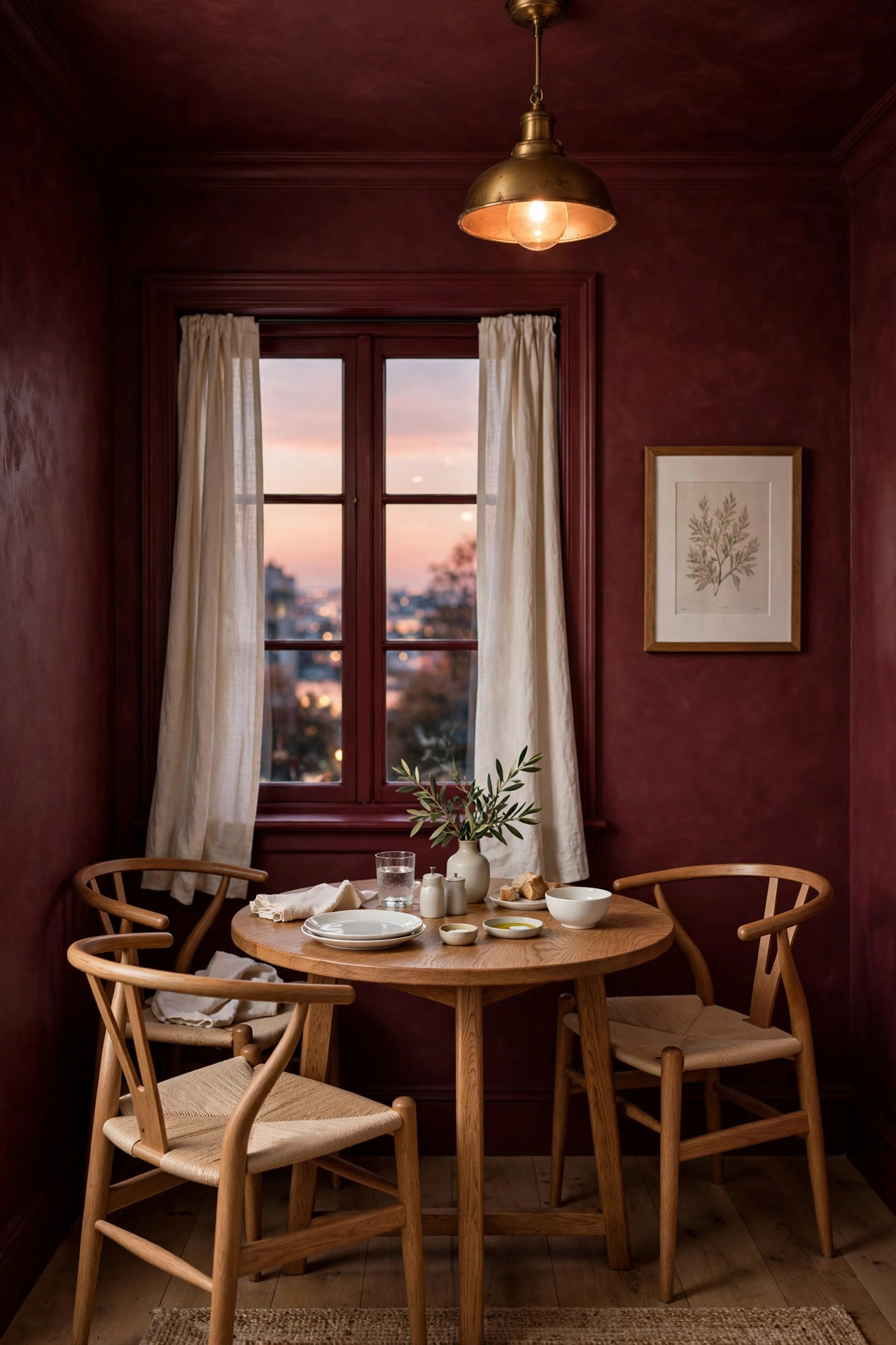
Picture this. You slide into a small dining nook wrapped in burgundy, a deep wine red with a brown heart that feels like velvet curtains and candlelight. The walls, the trim, the ceiling, and the window frame all wear it, so the little corner reads as one continuous glow of red. In the center sits a round oak table, its warm wood grain deepened by the burgundy behind it. Two wishbone style chairs in natural oak tuck beneath it, their pale wood and woven seats glowing against the dark red. Above the table hangs a single brass pendant with a warm bulb, and when it is lit, the whole nook fills with a rosy golden light that makes everything and everyone look wonderful. White dishes stacked on the table pop crisply against the burgundy wall behind them, like plates in a fine restaurant. A small brass bud vase holds a single deep red rose that nearly disappears into the wall color until you look twice. Cream linen curtains frame the window, their pale softness a beautiful contrast to the rich walls. By day, sunlight turns the burgundy bright and juicy near the window, like light shining through a glass of red wine. In the evening, with the pendant on, the nook goes deep and intimate, and dinner for two feels like an occasion even on a Tuesday. A small framed print with a wide white mat hangs on the wall, its pale border a crisp note against all that red.
Burgundy is a bold color, but a dining nook is a small canvas, which makes it the perfect place to be brave. You want a burgundy with a brown or wine undertone, not one that leans toward bright purple or fire engine red. Hold the swatch next to a piece of cream linen. If it looks rich and velvety, you have it. If it looks loud, keep looking. Keep the table and chairs in warm natural wood. Oak, walnut, and even a warm rattan all glow against burgundy, while black furniture would turn the nook too dark. White dishes are the classic move here. They pop against the red and make every meal look special. For lighting, one warm pendant over the table is all you need. The burgundy walls will drink up the light and give it back as a rosy glow. Add cream curtains or a cream runner to give your eyes one pale resting place. Too much dark without relief can feel heavy, even in a nook. A little brass goes a long way against burgundy, a pendant, a vase, a picture frame, each piece gleaming like jewelry. And do not leave the ceiling white. A white ceiling over burgundy walls would feel like a bright lid. The matching burgundy above you pulls the whole nook together into one warm delicious cocoon.
15. Cocoa Brown Bedroom
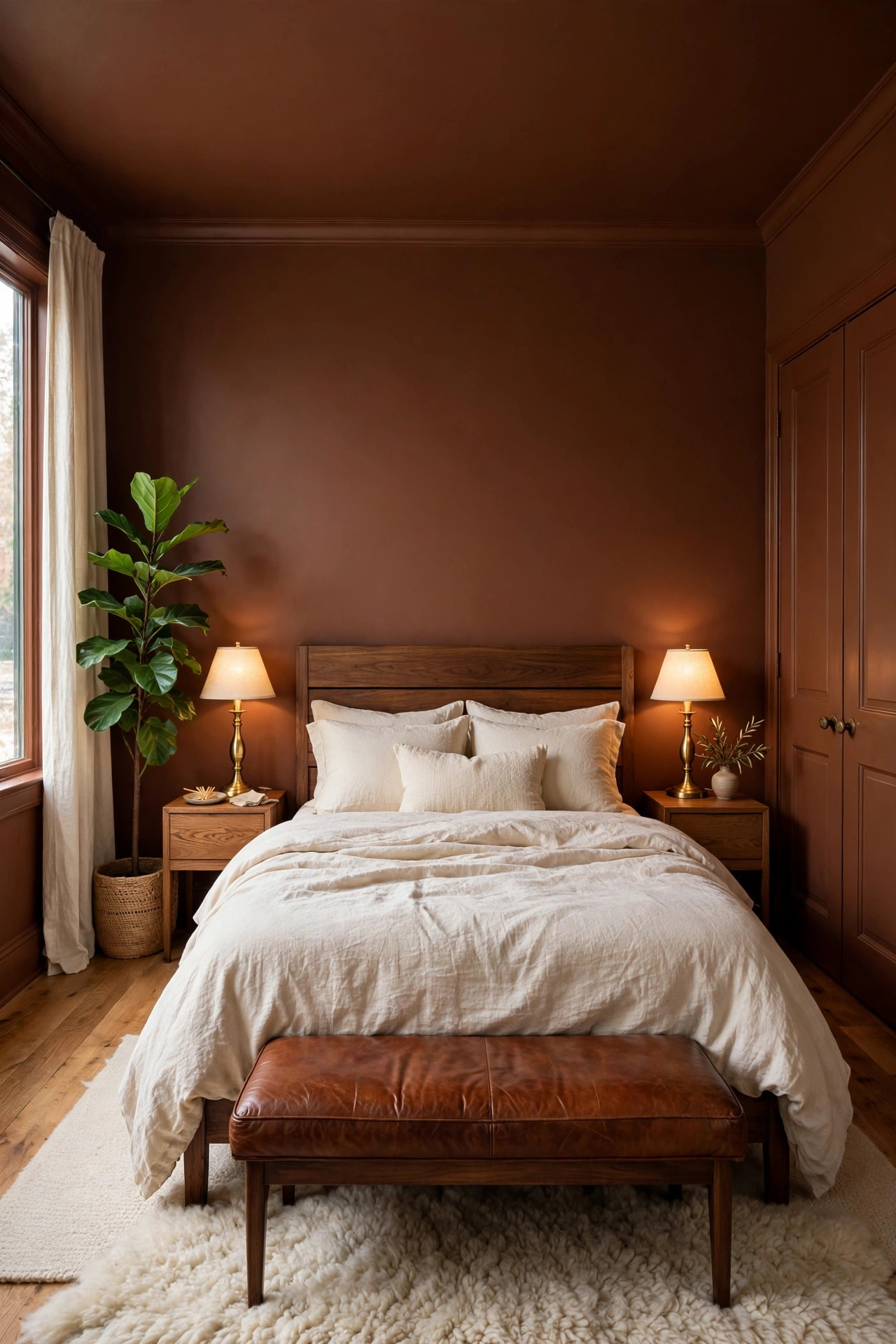
Picture this. You walk into a bedroom wrapped in cocoa brown, a rich medium brown that feels like melted chocolate and warm earth. The walls, the baseboards, the ceiling, and the closet doors all wear it, and the room feels like being tucked inside something delicious. Your bed sits against the main wall dressed in cream linen bedding, and the pale sheets look almost luminous against the deep brown, like cream poured into coffee. The headboard is warm walnut wood, and its dark grain melts beautifully into the cocoa walls while still showing its shape. On either side, oak nightstands hold brass lamps with cream shades, and when those lamps click on, the whole room turns the color of caramel, warm and glowing. A cream wool rug with a subtle pattern softens the dark wood floor. A cognac leather bench at the foot of the bed adds another layer of warm brown that harmonizes with the walls. By day, sunlight turns the cocoa bright and warm near the windows, like sun on tree bark. In the corners it deepens to a dark espresso that feels sheltering and safe. At night, with the lamps on, the bedroom feels like the inside of a hug, and falling asleep comes easy. A tall green plant in the corner looks incredibly alive against all that brown, and framed prints with wide white mats pop forward like gallery art.
Brown is having a real moment as the new neutral, and a cocoa drench is the coziest version of it. Choose a mid tone cocoa, not a dark espresso and not a pale tan. You want enough depth to feel enveloping but enough lightness that the room still glows in daylight. Test your swatch on the wall for a full day, because brown shifts between warm and cool as the light changes. Keep your bedding cream, oatmeal, or soft white. Pale bedding against cocoa walls is the whole look, and it is stunning. Warm woods are essential partners. Walnut, oak, and even rattan all feel natural beside brown. Stay away from cool gray woods and gray fabrics, which will fight the warmth and make the room feel muddy. Brass lighting is the dream match. It gleams against brown like nothing else. Add one green plant, because green against brown is the color story of nature itself, and it keeps the room feeling fresh. Art with wide white mats gives you crisp contrast that stops the brown from feeling flat. And paint the ceiling cocoa. This is the move that makes the bedroom feel truly wrapped. A white ceiling would chop the cocoon in half. The brown above you makes the whole room feel like a warm nest.
16. Slate Blue Kids Room
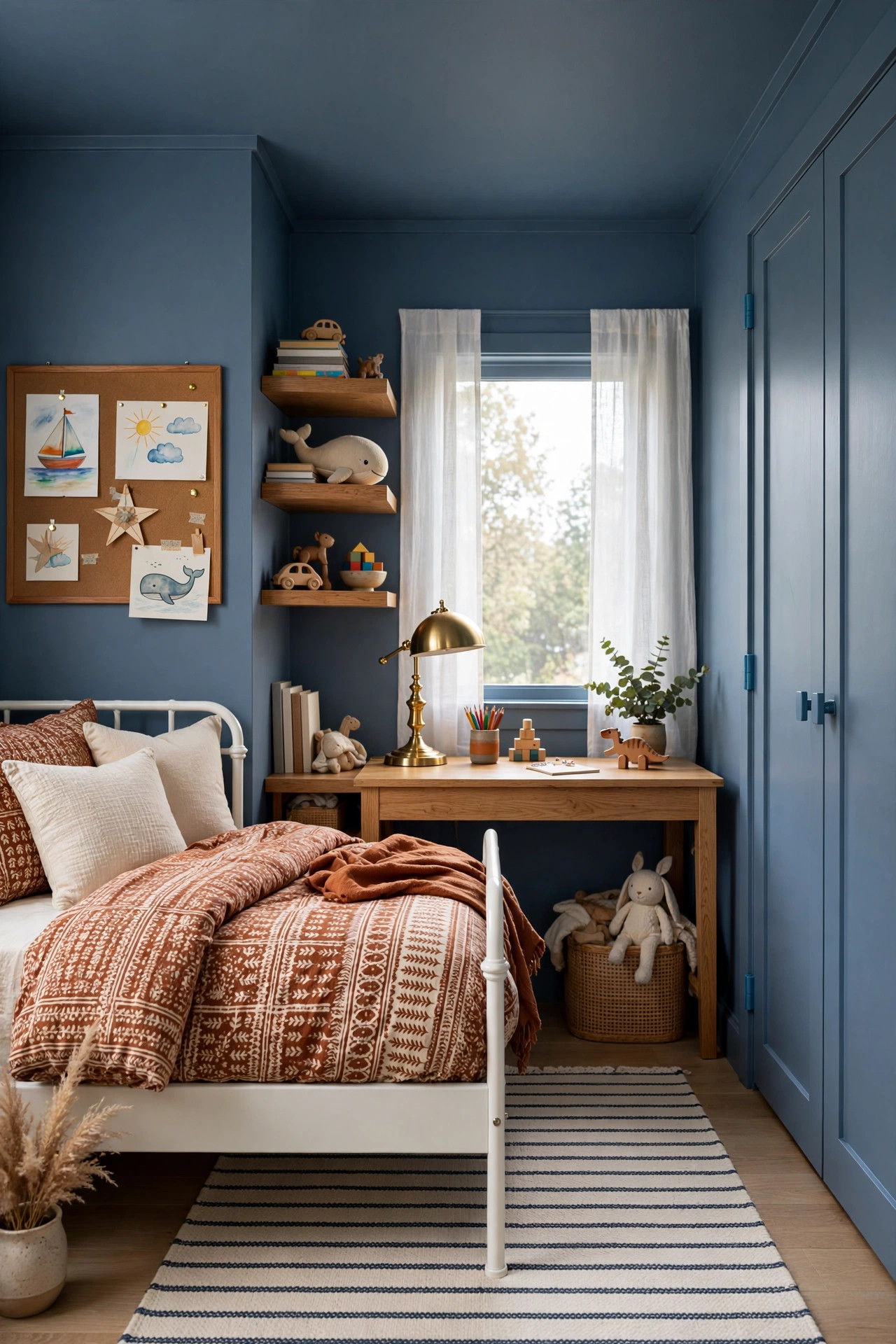
Picture this. You peek into a kids room washed in slate blue, a dusty blue gray that feels calm and a little bit grown up. The walls, the trim, the ceiling, and the closet doors all wear it, wrapping the room in one smooth cool hush. Against the blue, a white bed frame pops forward crisply, dressed in bedding with a fun pattern of rust and cream that looks extra vivid against the calm walls. A warm oak desk sits under the window, its honey wood glowing beside the blue, with a small brass lamp and a stack of colorful books. Above the desk, floating oak shelves hold trophies, model cars, and a row of bright book spines, all popping against the slate behind them like a display. A cream and navy striped rug covers the middle of the floor, adding pattern and a soft place to sit. On one wall, a big cork board in an oak frame holds art projects and photos, their colors singing against the blue. A tall green plant in the corner, the kind that survives anything, looks fresh and alive. By day, daylight turns the slate bright and airy near the window, a cheerful backdrop for play and homework. In the evening, with a warm lamp on, it deepens to a cozy denim tone that feels restful at bedtime. It is the rare kids room that feels fun for a child and calm for the parent who has to look at it.
Slate blue is the kids room color that does not scream kids room, which means you will not be repainting it in two years. It is calm enough for sleep, fresh enough for play, and neutral enough to work for any age. Choose a slate with a soft gray undertone rather than one that leans bright or babyish. The gray is what keeps it sophisticated. Use a washable eggshell or satin finish on the walls, because kids rooms take a beating from hands, toys, and everything else. Washable paint is not optional here. Keep the big furniture white or natural wood. A white bed against slate blue is crisp and classic, and oak pieces warm the cool walls beautifully. Let the color come from the easy to change things. Bedding, art, toy bins, and the cork board can all be bright and fun, and they will pop dramatically against the calm blue. A striped or patterned rug in cream and navy adds energy underfoot. For lighting, use warm bulbs. Cool white bulbs will push the slate toward gray and the room will lose its friendliness. And paint the ceiling the same slate blue. In a kids room, the matching ceiling makes the space feel wrapped and cozy, like a fort, which is exactly how a kids room should feel.
Conclusion
If there is one thing to take away from all sixteen rooms, it is this. Color drenching is not about being bold for the sake of being bold. It is about letting one beautiful color do its full job, from the baseboards to the ceiling, without white trim chopping it into pieces. Whether you go deep and moody with forest green or charcoal, warm and earthy with terracotta or cocoa, or soft and calm with sage or warm white, the result is the same. The room looks finished, intentional, and quietly expensive. And the best part is how little it costs. A few gallons of paint, a free weekend, and the courage to paint the ceiling too. Start small if you are nervous. A powder room, a hallway, or a reading nook will teach you everything you need to know. Then stand back, look at what one color did, and try not to start planning the next room.
FAQs
What is color drenching?
Color drenching means painting the walls, trim, ceiling, and doors of a room all in the exact same color. Instead of white trim and a white ceiling breaking up a colored wall, every surface wears one continuous color. The result looks calm and pulled together, and it is one of the simplest ways to make a room look like a designer planned it.
Does color drenching make a small room look smaller?
Not in the way most people fear. Because there are no contrasting edges, the corners of the room soften and the walls blur together, which often makes a small room feel bigger. Deep colors do pull walls visually closer, which makes the room feel cozier rather than tighter. Light colors drenched through a small room almost always make it feel larger.
Should the ceiling really be the same color?
Yes, and this is the step most people want to skip. A white ceiling in a drenched room chops the space in half and ruins the wrapped feeling. Painting the ceiling the same color is what makes the room feel finished and intentional. In rooms with tall ceilings, a darker drenched ceiling also brings the height down to a cozier proportion.
What paint finish should I use for color drenching?
Use eggshell or matte on the walls, satin on the trim and doors, all mixed in the same color. The slight change in sheen gives you quiet depth without breaking the single color look. In kitchens and bathrooms, choose a washable or bath rated paint in satin so the surfaces resist moisture and wipe clean.
What is the best color to try first if I am nervous?
Start with a warm white or a soft sage green. A warm white drench is the gentlest entry point and it makes almost any room feel larger and calmer. Sage green adds a little more personality while staying soft and easy to live with. Both are forgiving, and both pair beautifully with natural wood and cream textiles.
How much paint do I need to drench a room?
Plan on about one gallon per 350 to 400 square feet of surface, and remember you are painting far more surface than usual because the trim, doors, and ceiling all get color too. A small powder room might need just one gallon, while an average bedroom usually needs three to four gallons including two coats. Buy a little extra so you have enough for touch ups later.