
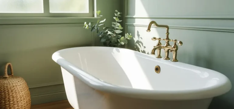
Picking a bathroom color used to mean staring at a wall of white paint chips and hoping for the best. That is not how it works anymore. This year, bathrooms are leaning into color the way living rooms and bedrooms already have, and the results feel a lot more like home. Earthy greens, warm clays, and soft neutrals are showing up in small powder rooms and big master baths alike, and none of it feels cold or clinical. If you have been staring at your bathroom wondering why it feels flat, the color on the walls is probably the reason. Below are 21 ideas you can actually use, whether you are painting a full wall, adding a tile accent, or just swapping out a few small details. Each one is easy to picture and even easier to start this weekend.
1. Sage Green Walls
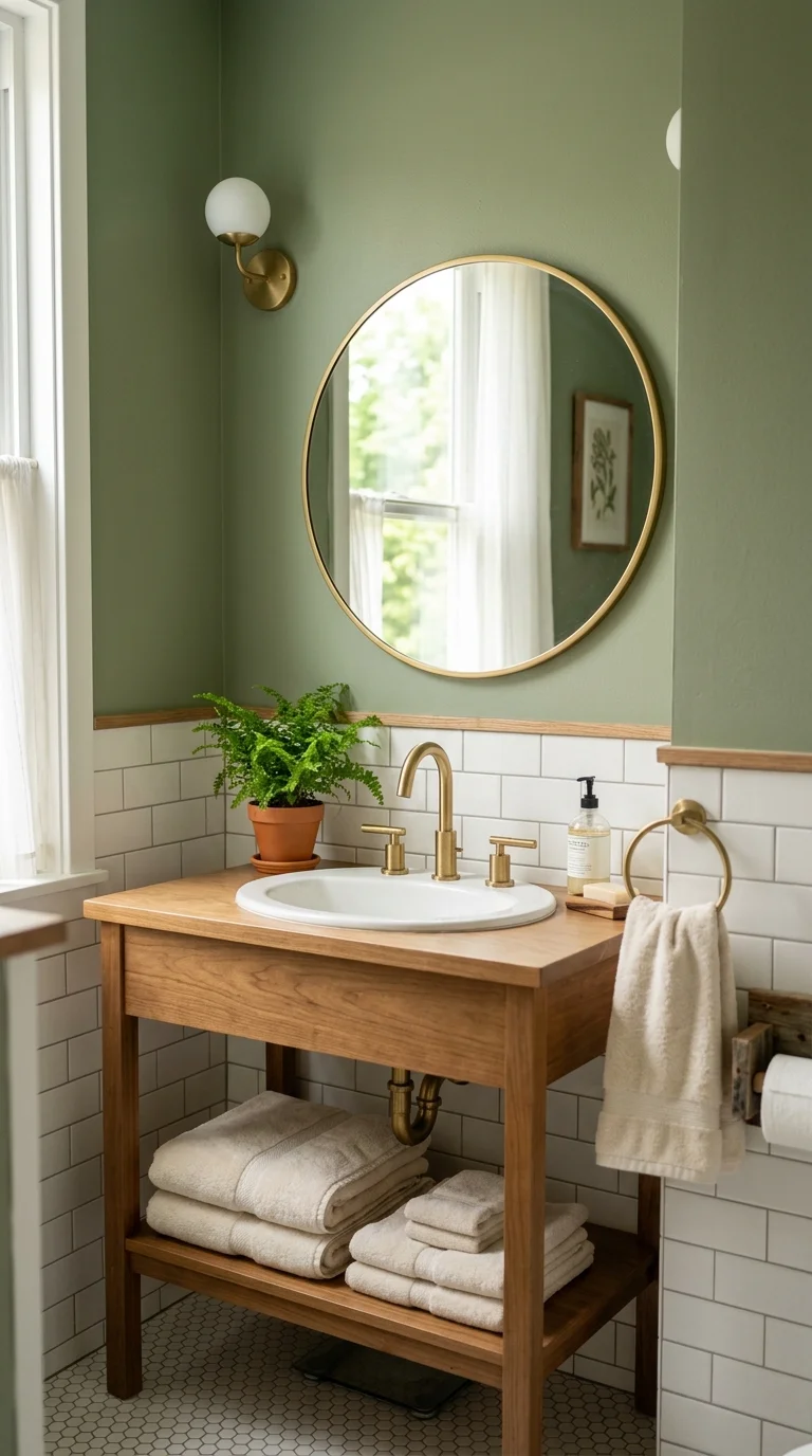
Sage green has quietly become one of the most requested bathroom colors, and it makes sense once you see it in person. It reads as calm and a little bit vintage without feeling dated, and it pairs beautifully with white subway tile, brass fixtures, or natural wood vanities. Use it on all four walls in a powder room for a bold, cocoon-like feel, or paint just the lower half below a chair rail if you want something more subtle. Sage also plays well with plants, so a small fern or eucalyptus stem on the counter finishes the look without any extra effort. If you rent and cannot paint, a sage green shower curtain or a set of hand towels can bring in the same tone. Stick to a matte or eggshell finish since bathrooms deal with moisture and steam, and a flat sheen hides small imperfections better than a glossy one. This color works in bathrooms with both warm and cool lighting, which makes it one of the safer greens to commit to.
2. Warm Terracotta Tones
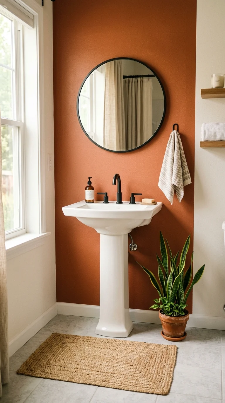
Terracotta brings instant warmth to a room that often feels sterile, and it works especially well in bathrooms that get a lot of natural light. Think of it less as a bright orange and more as a sun baked clay color, closer to a flowerpot than a traffic cone. Paint an accent wall behind the vanity, or go bigger and use terracotta tile on the floor for a Mediterranean feel that photographs beautifully. Pair it with white grout, black matte faucets, and a woven jute bath mat to keep the palette grounded. Terracotta also looks great against dark green plants, so a small potted snake plant on the floor near the tub adds texture without cluttering the space. If a full wall feels like too much, start with terracotta towels or a ceramic soap dish and build from there. This color tends to look best in bathrooms with warm toned wood accents, since cooler grays can make it feel slightly off.
3. Soft Clay Pink
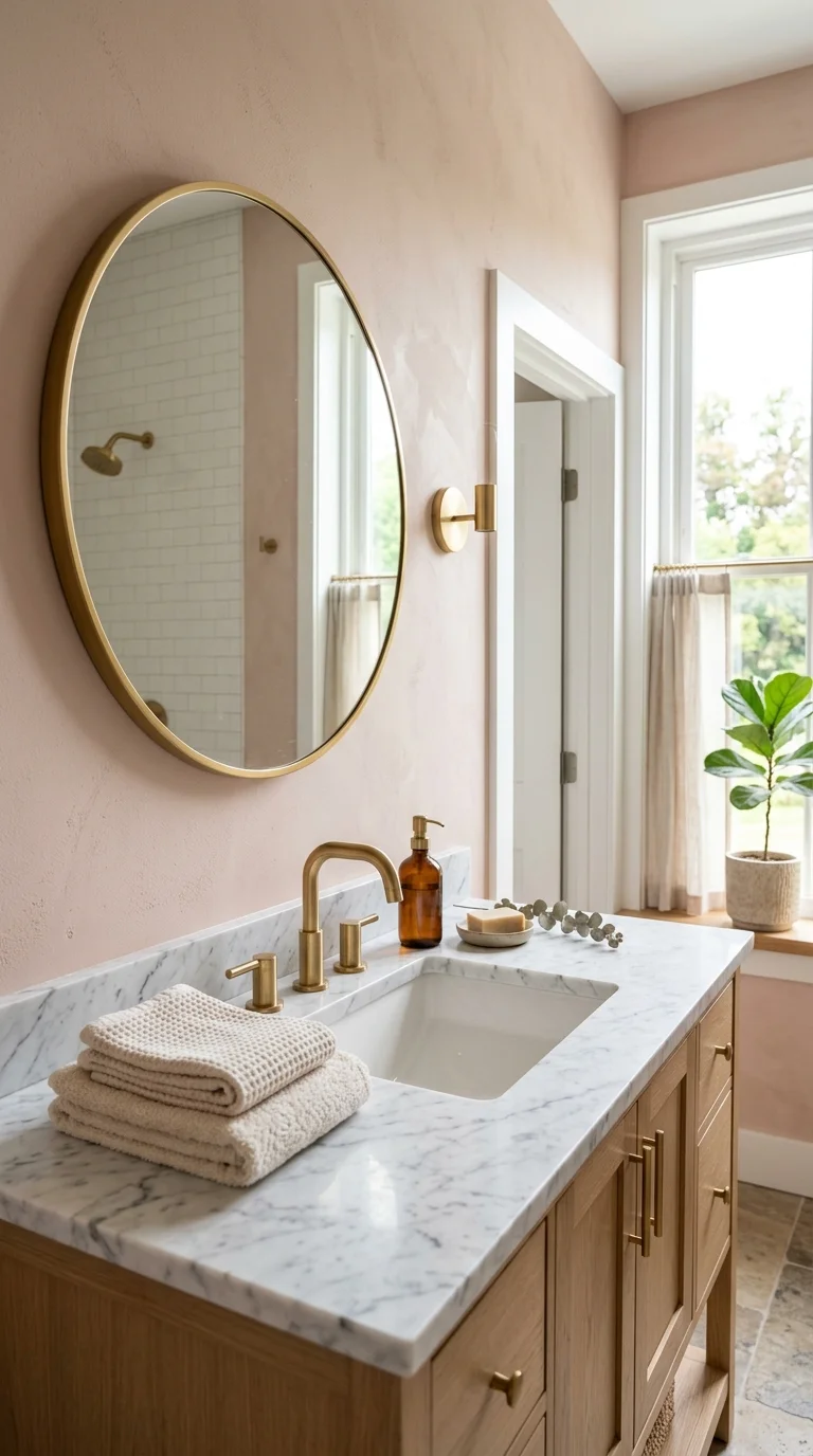
Soft clay pink is nothing like the cotton candy pink of decades past. This version leans dusty and muted, closer to a sunset than a candy shop, which is exactly why it works so well in adult bathrooms. Use it on the walls with a matte finish, or introduce it through a pink marble style countertop if you are already renovating. It pairs beautifully with brushed gold or unlacquered brass fixtures, since the warm metal tones echo the warmth in the paint. A round mirror with a thin gold frame and a stack of cream towels finishes the look without trying too hard. This color also works surprisingly well in small windowless bathrooms because it feels warm even under artificial light, unlike cooler pinks that can turn gray. If you want to test the color before committing, try a large piece of clay pink art or a shower curtain in the same tone to see how it feels in your specific lighting.
4. Deep Forest Green
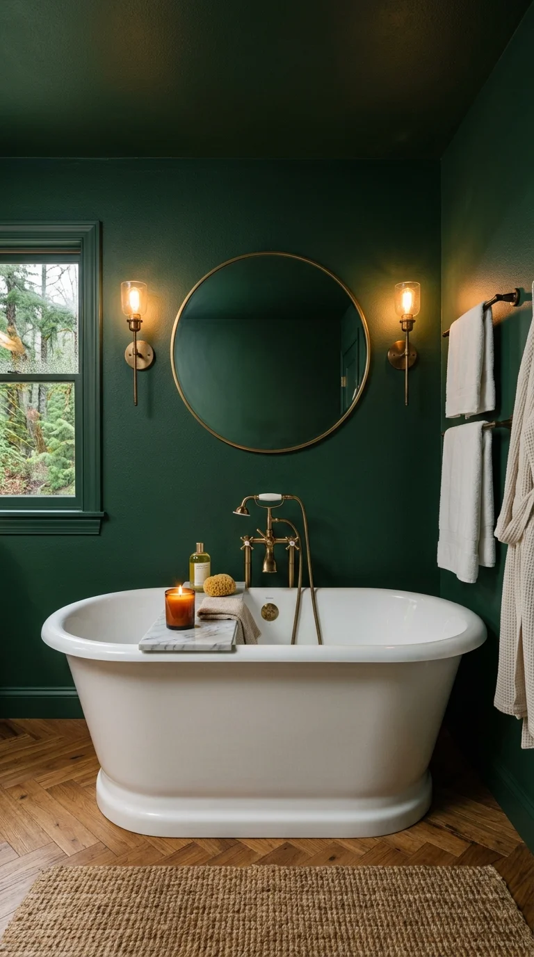
Deep forest green is the color to reach for if you want your bathroom to feel like a quiet retreat rather than a bright, busy space. It works especially well in bathrooms with a soaking tub, since the deep tone makes the whole room feel more intentional and spa like. Paint it on all the walls and ceiling for a fully enveloped look, or use it just around the tub as a defined zone. Brass or aged bronze fixtures look rich against this shade, and a simple white or marble countertop keeps the room from feeling too dark. Add a few brass sconces instead of harsh overhead lighting to really let the color shine at night. This tone also hides water spots and small marks better than pale colors, which makes it a practical pick for a busy family bathroom. If a full green room feels risky, start with green tile on just the shower wall and keep the rest of the room neutral.
5. Creamy Ivory Palette
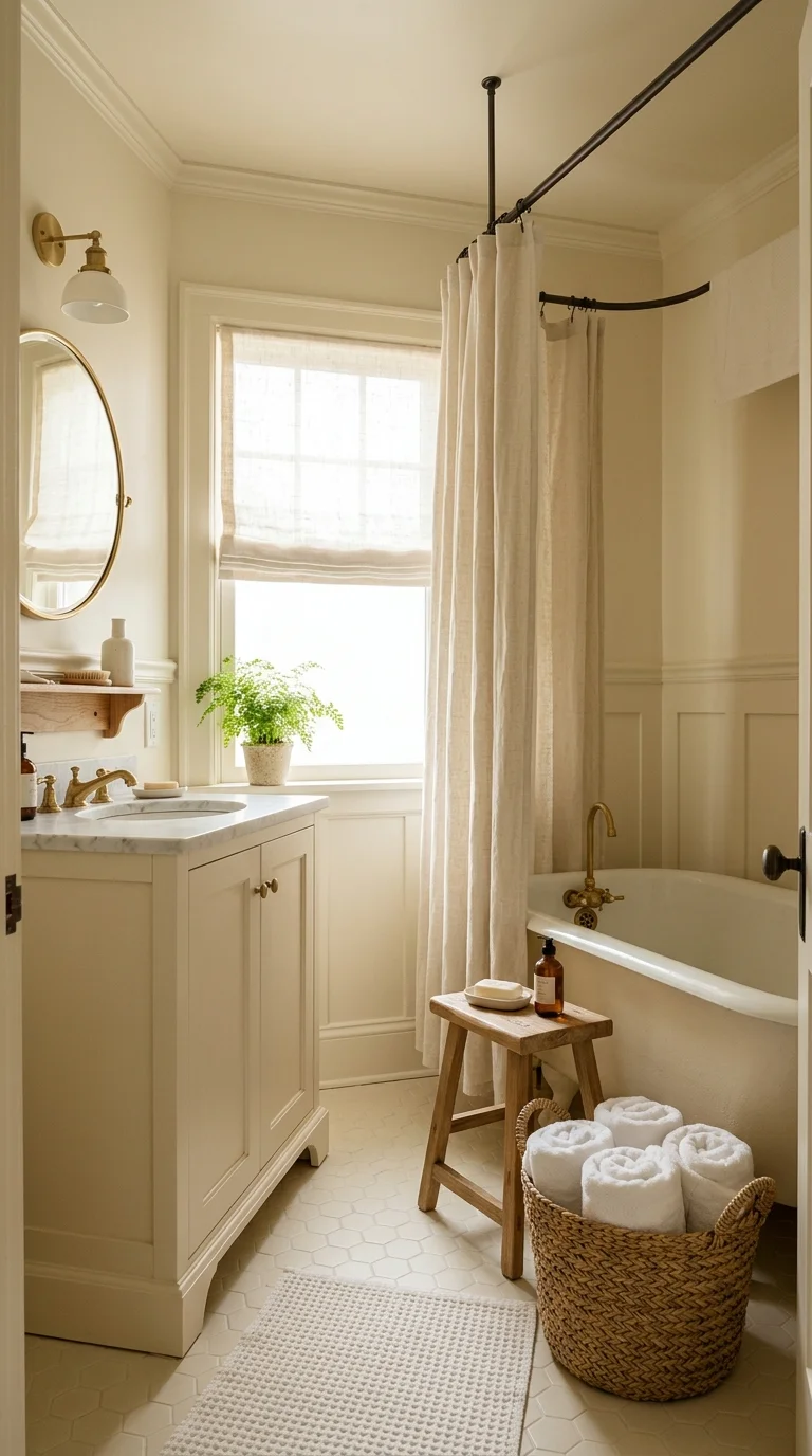
Creamy ivory is the answer for anyone who wants warmth without committing to a strong color. It is a step away from stark white but still feels bright and clean, which makes it a smart choice for smaller bathrooms that need to feel open. Use it on the walls, cabinetry, and even the countertop for a soft, monochromatic look that never feels boring thanks to the warmth in the undertone. Add texture through a woven basket for towels, a linen shower curtain, or a wood stool instead of a plastic one. Ivory also makes a great backdrop for other colors, so if you already own colorful art or patterned textiles, this shade lets them stand out. Unlike bright white, ivory does not show every fingerprint and water spot right away, which is a small but real bonus for a family bathroom. Pair it with warm brass or matte black hardware depending on whether you want a soft or more graphic contrast.
6. Muted Olive Accent
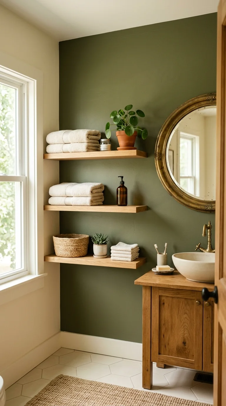
Olive brings the earthy, grounded feeling of sage green but with a bit more depth and a slightly more grown up edge. It works especially well as an accent wall behind open shelving, where the color acts as a backdrop for towels, plants, and everyday items rather than competing with them. Pair olive with warm wood shelving and cream colored towels to keep the palette soft, or go bolder with black hardware and a patterned tile floor for more contrast. This color also looks great paired with vintage brass mirrors, since the aged metal tone matches the earthy feel of the paint. If you are not ready to paint, olive green hand towels or a small rug near the sink can test the waters. Olive tends to look slightly different depending on the time of day, so it is worth watching a sample patch for a full day before painting the whole room.
7. Warm Taupe Walls
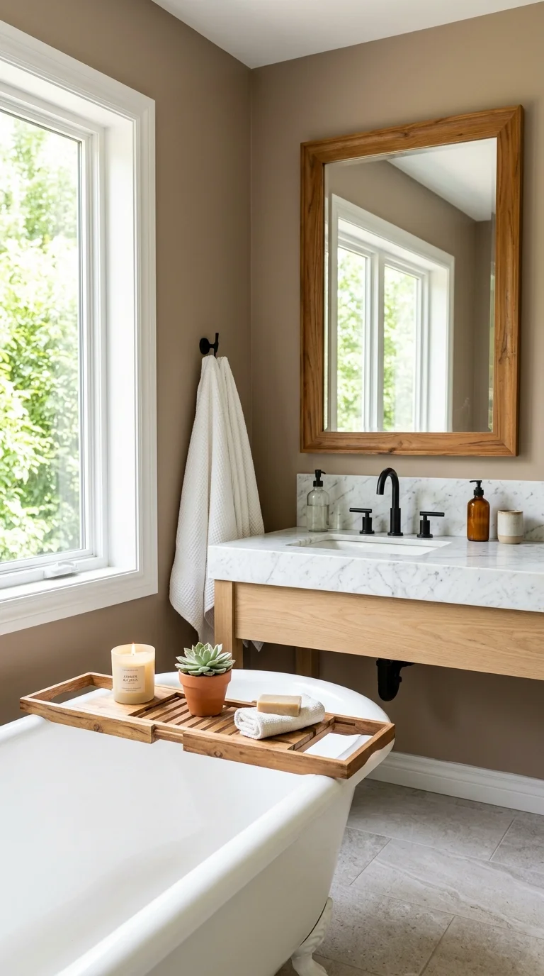
Warm taupe sits right between beige and gray, and it has become a favorite for bathrooms that want to feel neutral without feeling cold. It works in almost any lighting situation, which makes it one of the more forgiving colors on this list for bathrooms without much natural light. Use it on the walls with a simple white or marble vanity top, and bring in warmth through wood accents like a teak bath tray or a wood framed mirror. Taupe also pairs nicely with black fixtures if you want a slightly more modern look, or brass if you prefer something softer. This color is a smart pick for anyone planning to sell their home soon, since it appeals to a wide range of tastes while still feeling more current than plain white. Keep the rest of the room simple with white towels and minimal clutter so the warm wall color gets to do the talking.
8. Dusty Blue Charm
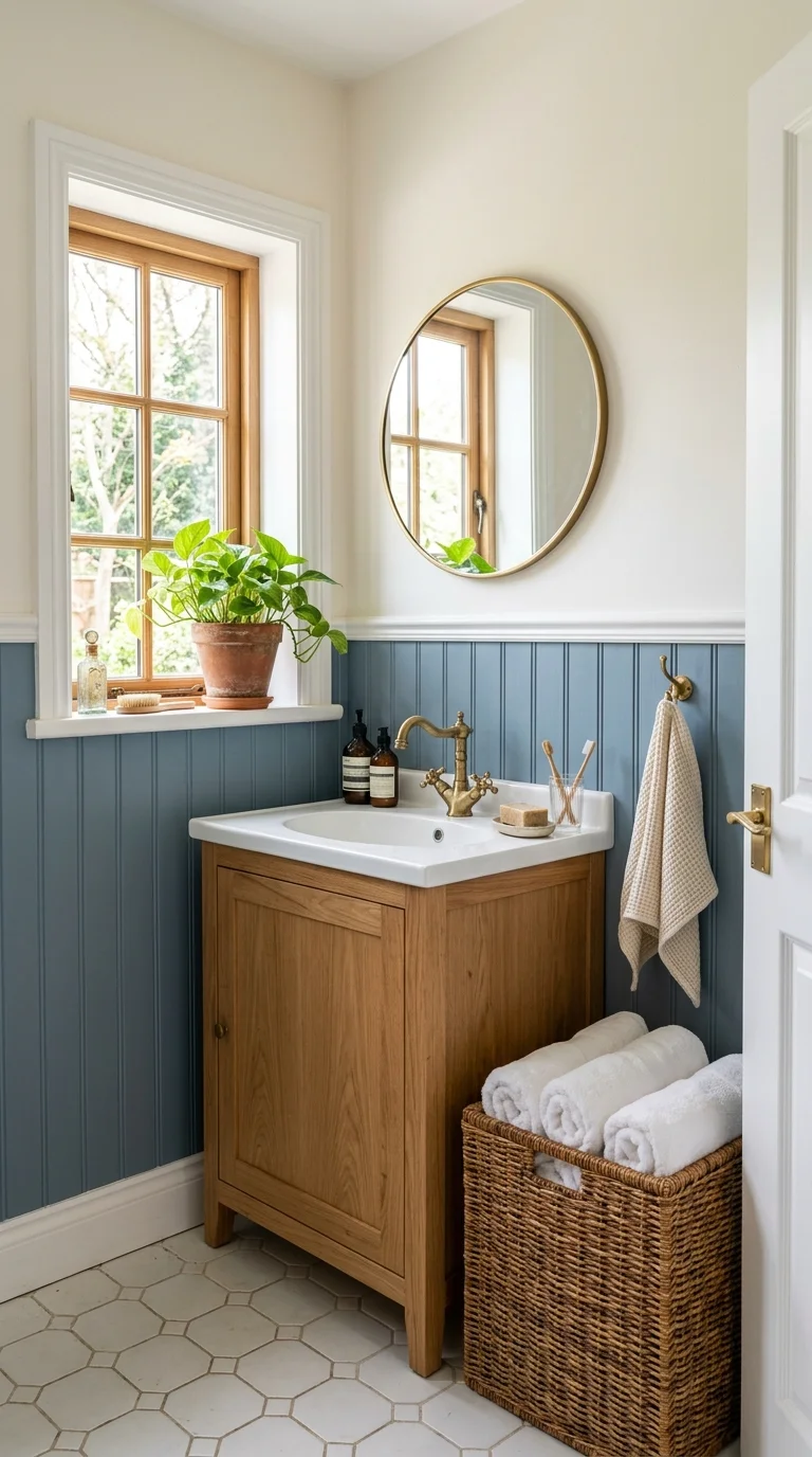
Dusty blue has a gentle, worn in quality that keeps it from feeling too crisp or nautical, which is why it fits so well into the warmer color trends taking over bathrooms this year. Paint it on beadboard paneling for a cottage feel, or use it as a full wall color paired with white trim for something a little more classic. It pairs beautifully with natural wood vanities, wicker baskets, and brass hardware, all of which soften the coolness of the blue. A dusty blue shower curtain with a simple stripe pattern can bring the color in without any painting at all. This shade also looks lovely next to greenery, so a small potted plant on the windowsill adds a nice contrast. Dusty blue tends to look best with warm white trim rather than stark white, since the slight contrast keeps the room from feeling too flat or one note.
9. Buttery Yellow Touch
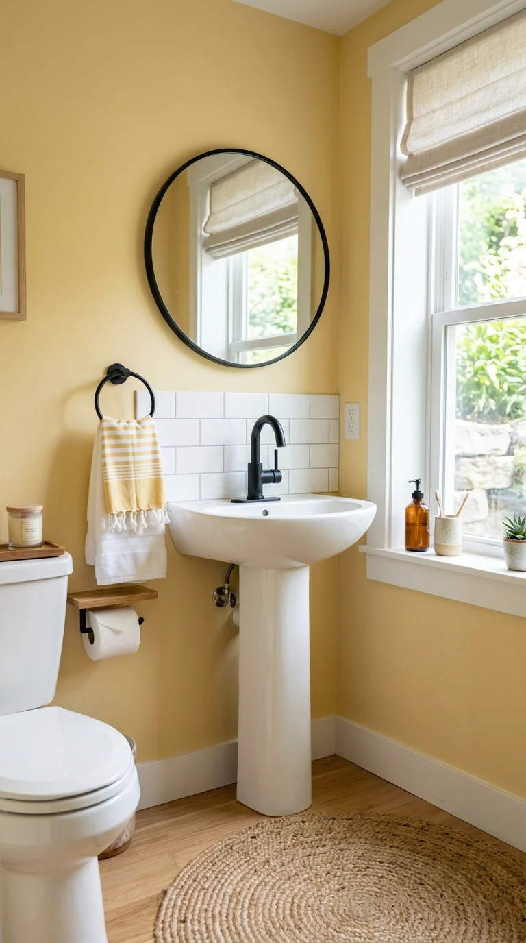
Buttery yellow is soft enough to feel calming rather than loud, and it brings genuine cheer into a room that people often visit first thing in the morning. Use it as a full wall color in a powder room, or keep it to a lower third with white paneling above if you want something more subtle. This shade pairs nicely with white subway tile, black or brass fixtures, and simple woven textiles like a jute bath mat. A small stack of white towels with a yellow striped hand towel on top adds color without overwhelming the space. Buttery yellow also works well in bathrooms with limited natural light, since the warm undertone makes the room feel sunnier even under artificial bulbs. If painting feels like a big step, start with a yellow ceramic soap dispenser or a framed print in a similar tone to see how the color feels in your space first.
10. Rich Chocolate Brown
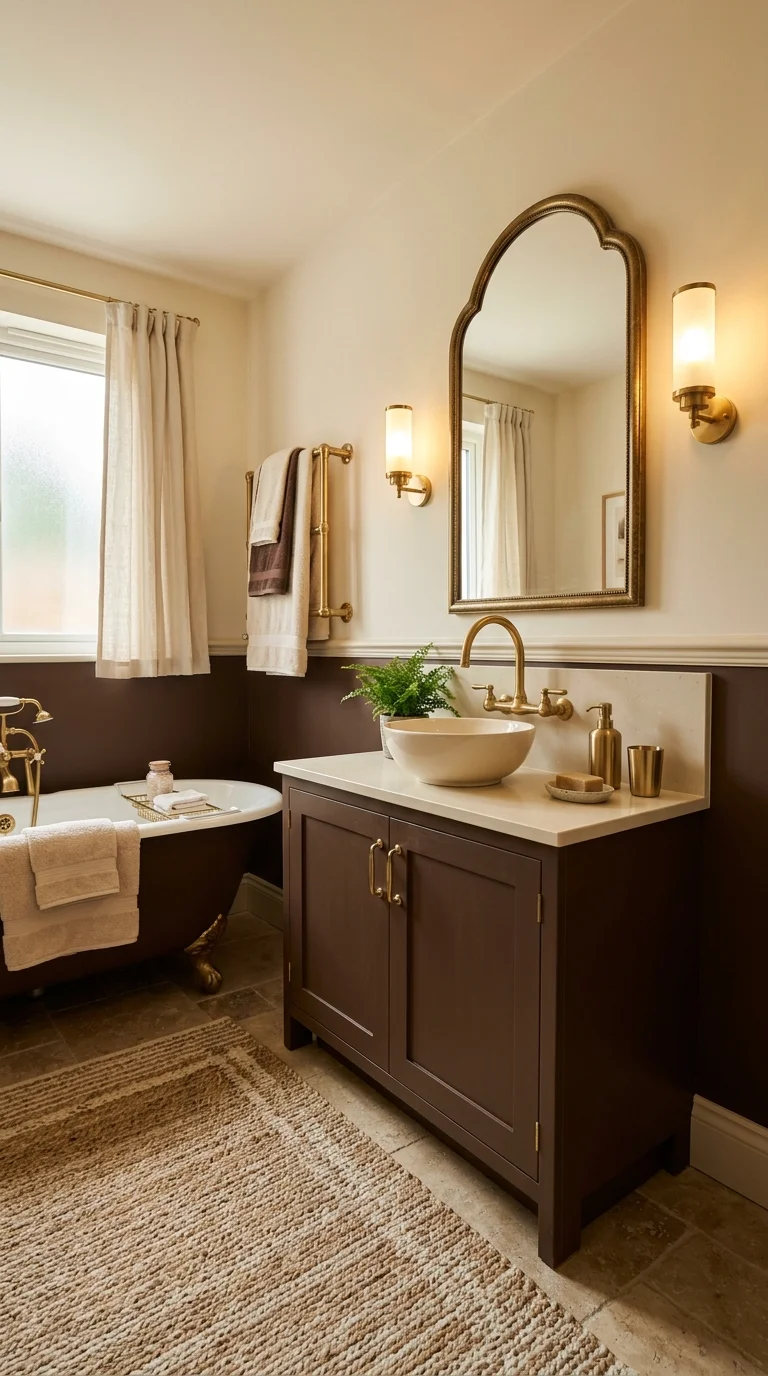
Chocolate brown has moved from old fashioned to genuinely stylish, especially when paired with warm metals and creamy textiles. Use it on the lower half of the wall with a chair rail, or go all in with a fully painted room for a cozy, enveloping feel that works especially well in bathrooms with a tub. Brass or unlacquered brass fixtures look stunning against this shade, and a cream or white countertop keeps the space from feeling too heavy. Add texture through a woven rug, a wood stool, or linen towels in a warm ivory tone. This color hides water marks and everyday wear better than lighter shades, which makes it a smart pick for a busy household bathroom. If a full brown room feels like too much of a commitment, try brown tile on just the shower floor or a chocolate colored vanity paired with white walls.
11. Soft Sand Beige
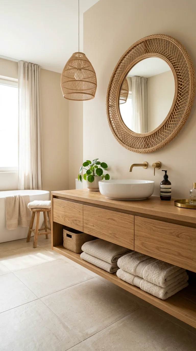
Soft sand beige has a quiet, warm quality that makes a bathroom feel like a boutique hotel without much effort. It works on walls, cabinetry, or even paired with a sand colored large format tile on the floor for a seamless, calming look. This shade pairs naturally with wood accents, cream towels, and simple brass fixtures, all of which lean into the same warm, understated palette. A woven pendant light or a rattan mirror frame adds texture that keeps the room from feeling flat. Sand beige is especially good for bathrooms that connect to a bedroom, since it creates a smooth visual flow between the two spaces. Unlike stark white, this tone hides small scuffs and water spots, which matters in a room that gets used every single day. Keep accessories simple and in the same warm family to let the color feel intentional rather than accidental.
12. Moody Charcoal Gray
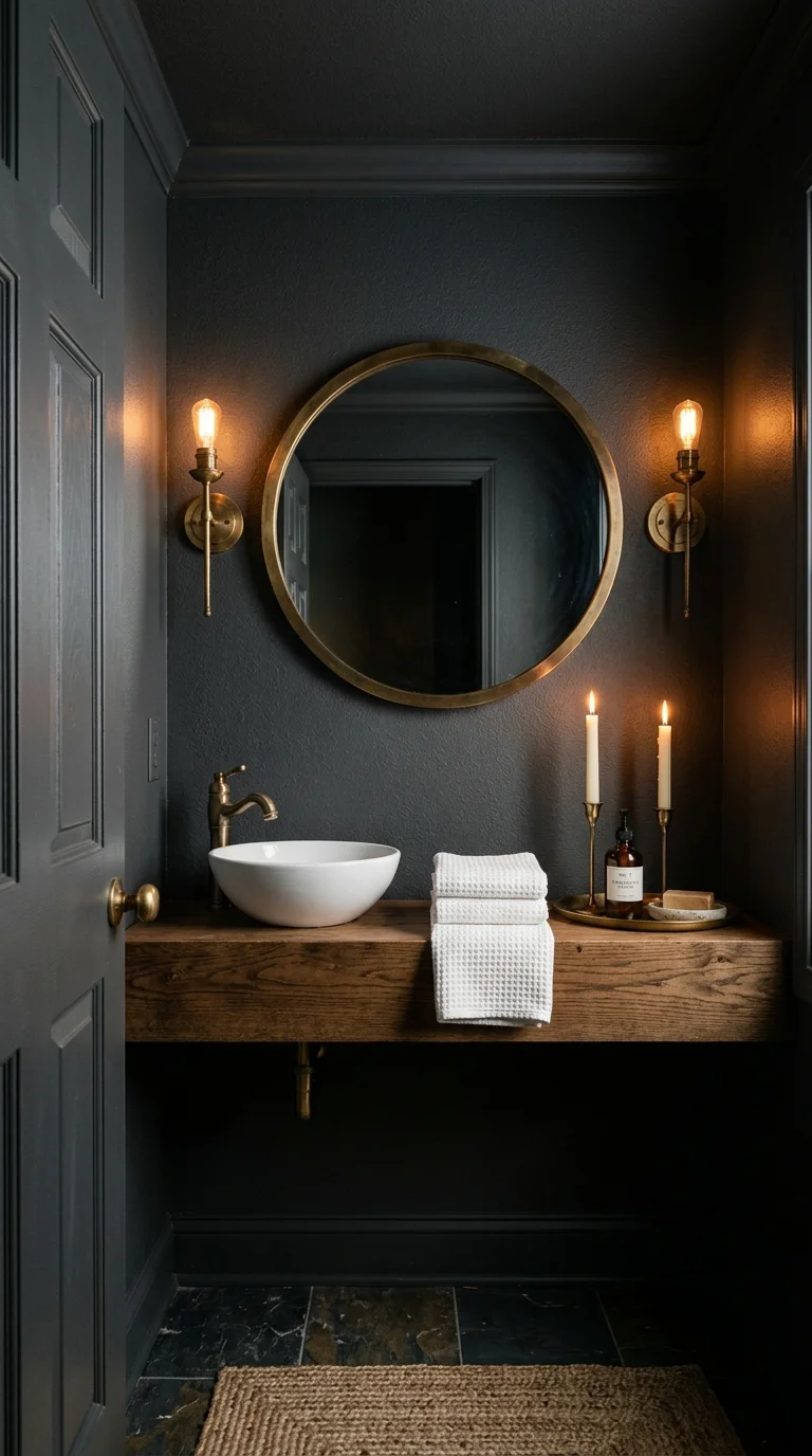
Charcoal gray brings drama to a bathroom without going as dark or bold as black, making it a good middle ground for anyone who wants a modern, moody look. Paint it on all the walls in a powder room where you only spend a few minutes at a time, or use it just around the vanity mirror as a bold accent. Pair it with brass or gold fixtures to warm up the coolness of the gray, and add a wood stool or shelf to bring in some natural texture. White towels and a simple round mirror keep the space from feeling too heavy. Charcoal also photographs beautifully with candlelight, so a few taper candles on the counter can turn a quick evening routine into something that feels a little more special. This color works best in bathrooms with good lighting, either natural or a well placed vanity light, since charcoal can feel too dark in a dim room.
13. Warm Terra Cotta Tile
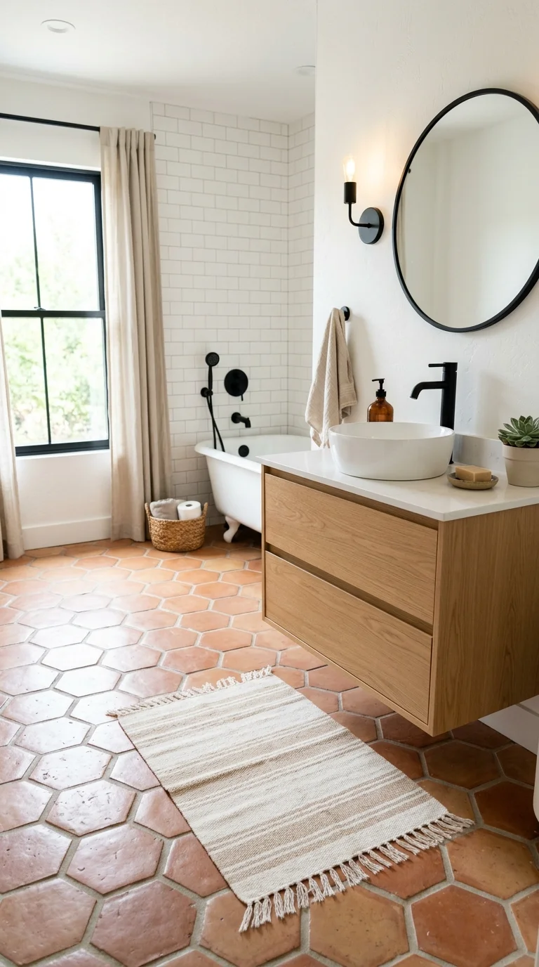
While terracotta paint brings warmth to the walls, terracotta tile does the same for the floor and takes the look a step further. Hexagon or classic square terracotta tiles add texture and a handmade feel that plain porcelain cannot match. Pair the tile with white walls and black fixtures for contrast, or lean into a fully warm palette with cream walls and brass hardware. This flooring choice works especially well in bathrooms with natural light, since the clay tones seem to glow a little in the sun. A simple striped bath mat in cream or rust keeps the floor from feeling too busy when paired with patterned tile. Terracotta tile also tends to hide dust and small marks better than white flooring, which is a practical win for any bathroom that gets daily use. If a full floor feels like too much, use terracotta tile on just the shower floor as a smaller starting point.
14. Earthy Rust Accent
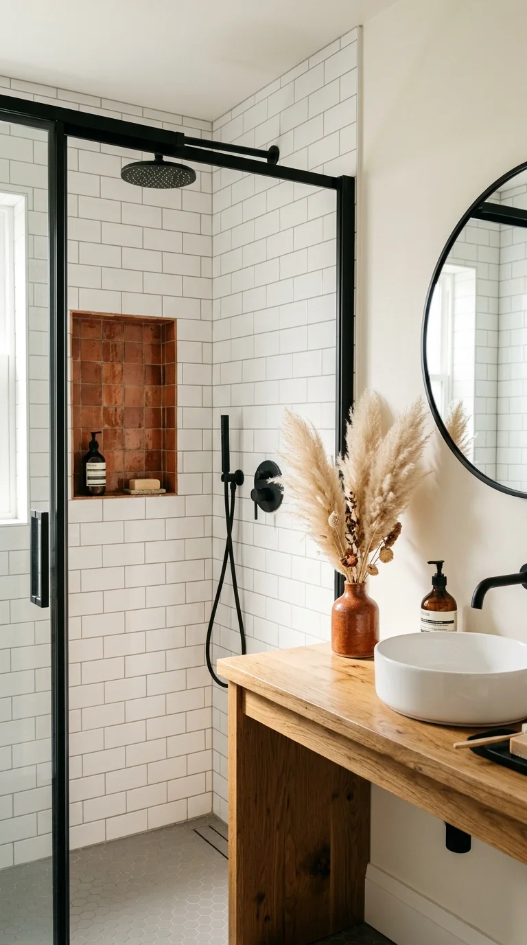
Rust is terracotta’s slightly deeper, more dramatic cousin, and it works beautifully as an accent color rather than an all over paint choice. Use it on a single accent wall behind the vanity, on patterned tile, or through textiles like a rust colored waffle towel set. This shade pairs naturally with black fixtures and warm wood accents, creating a look that feels both modern and a little bit rustic. A rust colored ceramic vase with dried pampas grass on the counter brings the color in without any painting at all. Rust also looks striking against white subway tile, so a small tiled niche in the shower can act as a bold pop of color in an otherwise neutral space. Because rust is a strong, saturated tone, it works best in smaller doses, either as one wall, one tile pattern, or a handful of accessories rather than covering the entire room.
15. Pale Eucalyptus Green
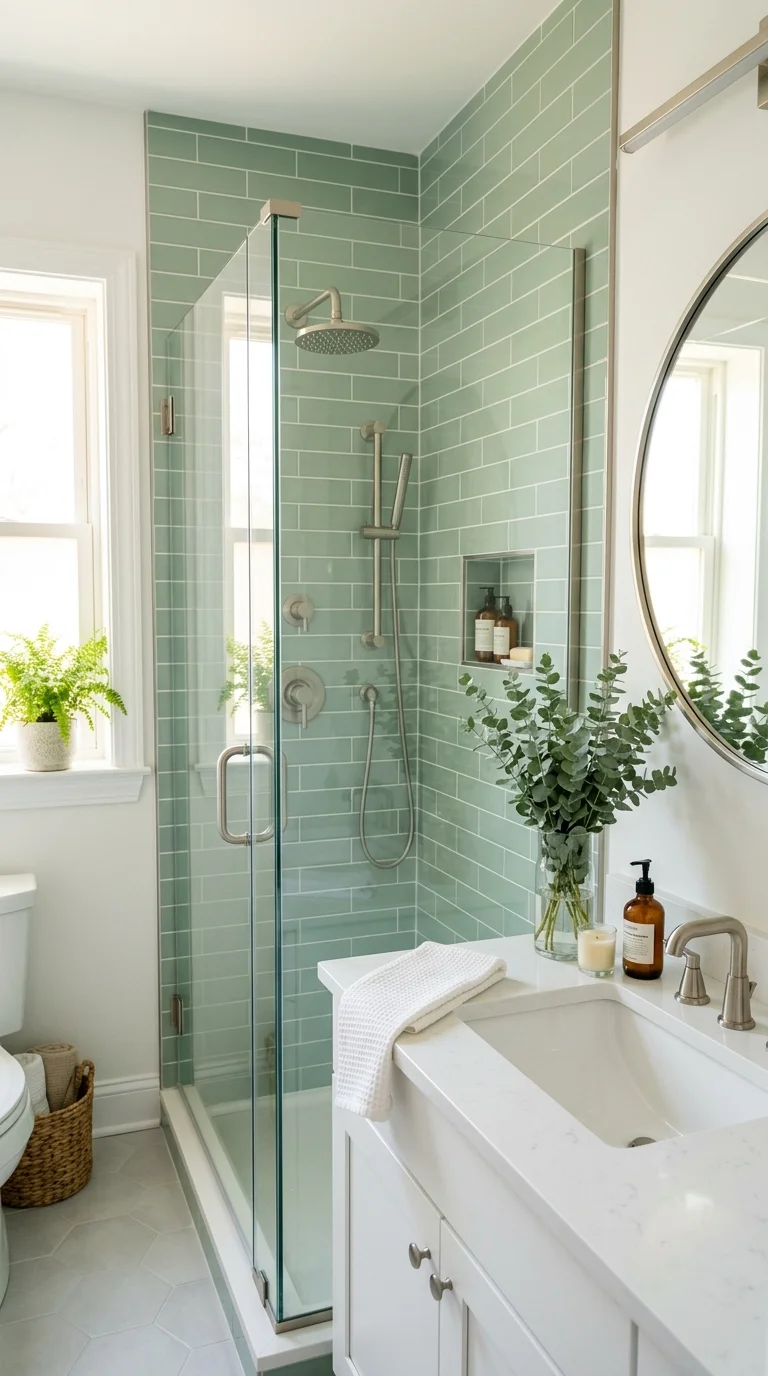
Pale eucalyptus green is softer and cooler than sage, closer to the actual color of eucalyptus leaves, and it brings a fresh, almost spa like quality to a bathroom. Paint it on the walls with white trim for a crisp, clean look, or use eucalyptus green tile on the shower walls for something more permanent. This color pairs beautifully with brushed nickel or chrome fixtures if you want a cooler, more modern feel, though it still works with brass for something warmer. A small bundle of real or dried eucalyptus in a simple vase ties the whole look together without much effort. This shade tends to look best in bathrooms with plenty of natural light, since it can read a little flat under warm artificial bulbs alone. Keep towels and accessories in white or cream to let the wall color stay the star of the room.
16. Warm Almond Neutral
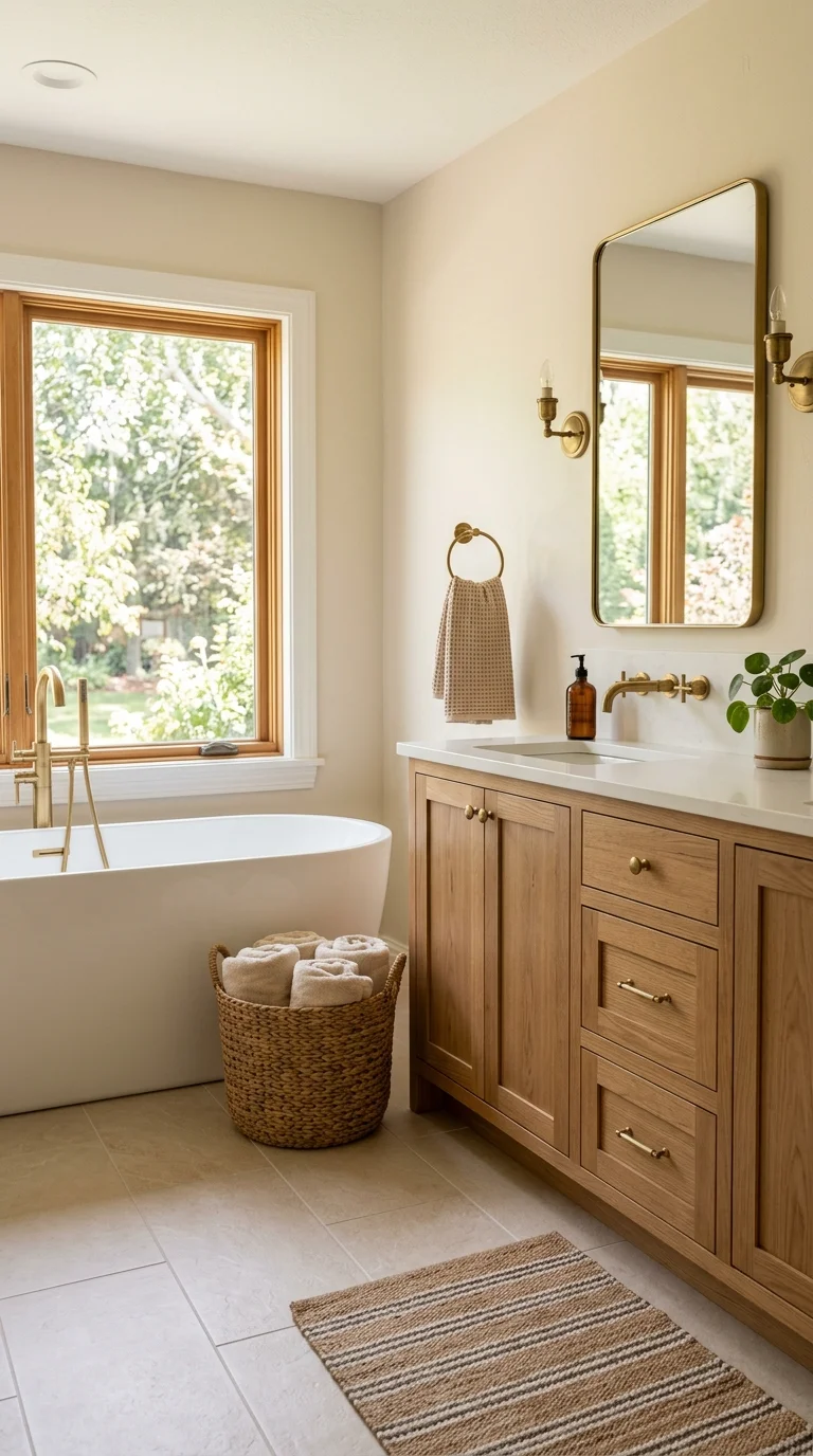
Almond sits between beige and white, offering warmth without leaning too far into any one direction, which makes it an easy color to live with long term. Use it on walls, vanity cabinetry, or a large format floor tile for a cohesive, calming look throughout the whole room. This neutral pairs well with almost any fixture finish, from brass to matte black to brushed nickel, which makes it a flexible choice if you plan to update hardware over time. A woven basket for extra towels and a simple wood tray on the counter add texture without adding more color. Almond also works well alongside patterned elements, like a striped shower curtain or a patterned bath mat, since the neutral wall gives those patterns room to stand out. This is a strong pick for anyone who wants their bathroom to feel current now and still look good in five years.
17. Deep Navy Drama
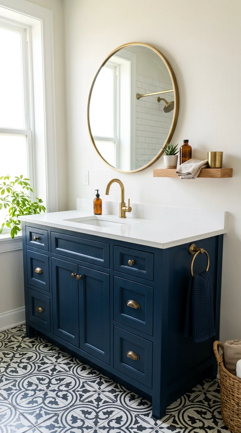
Navy blue brings serious depth to a bathroom, and when paired with warm metals instead of cool ones, it avoids feeling too stark or nautical. Paint all four walls for a fully immersive, moody feel, or use navy on just the vanity cabinetry while keeping the walls a lighter neutral. Brass or unlacquered brass hardware looks especially rich against navy, and a white or marble countertop keeps the space from feeling too heavy. Add warmth through wood floating shelves or a woven bath mat in a cream tone. Navy also works beautifully in bathrooms with black and white patterned floor tile, since the deep blue ties the two tones together nicely. This color tends to photograph especially well, so if your bathroom often ends up on your phone camera roll, navy is a strong choice for a space that feels a little more elevated than the usual white box.
18. Soft Blush Pink
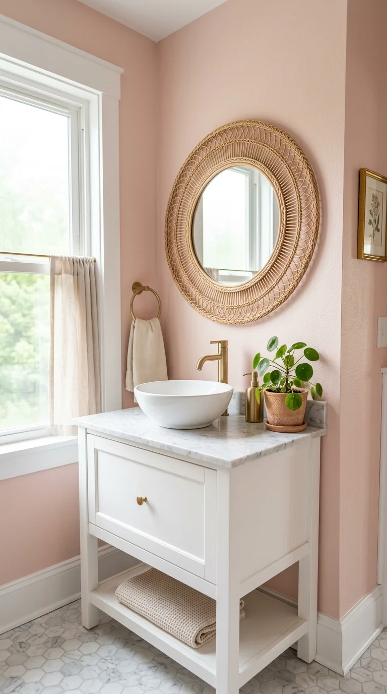
Soft blush pink has held on as a favorite because it manages to feel both calming and a little bit special without being loud. Use it on the walls with white trim for a classic look, or bring it in through blush colored tile on a shower accent wall. This shade pairs beautifully with brushed gold fixtures and marble countertops, leaning into a slightly more polished, feminine feel, though it also works well with simple black hardware for contrast. A round rattan mirror and a small potted plant soften the look and keep it from feeling too sweet. Blush works especially well in bathrooms that get soft, indirect light, since harsh direct sun can sometimes wash out the subtlety of the color. Keep the rest of the palette simple, sticking mostly to white and cream, so the blush walls remain the clear focal point of the room.
19. Warm Honey Wood Tones
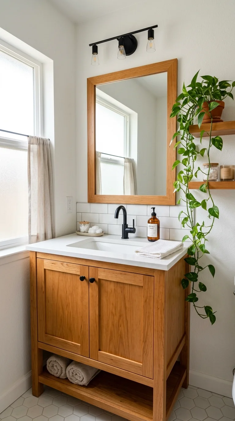
This idea leans less on paint and more on wood, using warm honey toned vanities, shelving, or even a wood accent wall to bring color and texture into the bathroom at the same time. Pair honey wood with white walls and black fixtures for contrast, or with cream walls and brass hardware for an all warm, cohesive look. A wood framed mirror and a matching wood stool tie the elements together without needing much else. This approach works especially well in bathrooms that currently feel cold or clinical, since wood adds instant warmth in a way that paint alone sometimes cannot. Honey wood tones also pair beautifully with green plants, so a trailing pothos on a floating wood shelf brings in life and color at the same time. If a full vanity swap is not in the budget, start with a small wood stool or a wood framed mirror to test the look.
20. Muted Mustard Accent
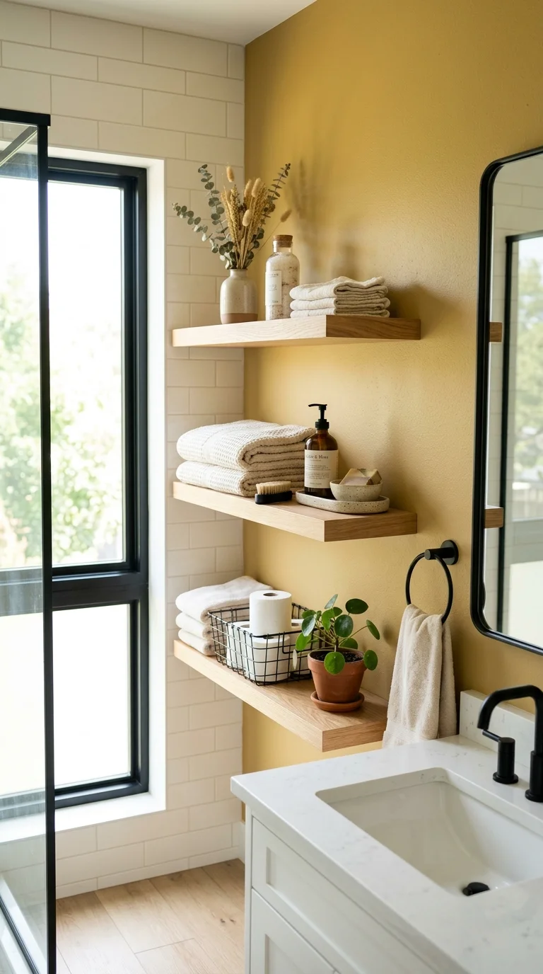
Mustard yellow, when muted rather than bright, brings a cozy, autumnal warmth into a bathroom without feeling like a seasonal decoration. Use it as an accent wall behind open shelving, or bring it in through a patterned tile that mixes mustard with cream and rust tones. This color pairs naturally with black fixtures and warm wood shelving, creating a look that feels grounded rather than overly bright. A mustard hand towel or a small ceramic tray on the counter is an easy way to test the color before committing to paint. Mustard also looks lovely paired with green plants, since the two tones sit close together on the color wheel and complement each other naturally. Because this is a bold, attention grabbing color, it works best in smaller doses, whether that means one wall, one tiled area, or a handful of accessories rather than the whole room.
21. Classic Warm White
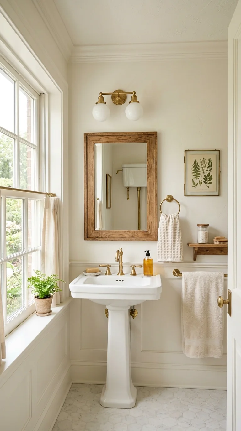
Sometimes the best color update is simply choosing the right white. A warm white, one with a hint of cream or beige rather than a stark, cool tone, can completely change how a bathroom feels without any bold commitment. Use it on the walls, ceiling, and trim for a soft, cohesive look, then bring in color through towels, a bath mat, or a piece of art. Pair warm white with brass fixtures and wood accents for a cozy feel, or with black fixtures for something a little more graphic. This shade is especially useful in small or windowless bathrooms, since it reflects available light without feeling as cold as a true white. Warm white also serves as an easy backdrop if you like to switch out towels and accessories seasonally, since almost any color works well against it. It is a simple, low risk update that still makes a real difference in how the room feels.
FAQs
What is the most popular bathroom color for 2026?
Warm, earthy tones like sage green, terracotta, and warm taupe are leading the way this year, replacing the all white bathrooms that were popular for so long.
Are dark bathroom colors a bad idea in a small space?
Not at all. A small bathroom with good lighting and a mirror can handle a dark, moody color like navy or charcoal beautifully, since the space is often used only briefly at a time.
What color pairs well with almost any bathroom style?
Warm neutrals like taupe, sand beige, and warm white pair well with nearly any fixture finish and style, making them a safe long term choice.
Do I need to paint the whole room to try a new color?
No. Towels, a shower curtain, a bath mat, or a single accent wall are all easy, low commitment ways to test a color before painting the entire room.
A Few Last Thoughts
Bathroom color does not need to be complicated. Pick one or two shades that feel warm and comfortable to you, start small if you are not sure, and let the rest of the room build around that choice. Small changes add up fast in a space this size.